The Importance of First Impressions
Your entryway is the handshake of your home. It sets the tone, establishes your aesthetic, and provides the critical first impression for anyone walking through the door. Yet, surprisingly, it is often the most neglected or poorly designed space in a house. When designing a minimalist and clean entryway, the margin for error is slim. Clutter, poor lighting, and awkward scale can instantly ruin the sleek, serene vibe you are aiming for. In this comprehensive guide, we will break down the most common entryway decor mistakes people make and provide actionable, elegant solutions to help you craft a stunning, functional foyer that perfectly encapsulates the minimalist philosophy. By understanding what not to do, you can elevate your hallway from a mere transitional corridor into a breathtaking design statement.
Minimalism is not about living in a stark, empty box; it is about intentionality. Every item in a minimalist entryway must serve a purpose, whether functional or strictly aesthetic. When mistakes are made in this space, they usually stem from a lack of planning or a failure to balance utility with beauty. We will explore how to tackle the eternal struggle of shoe storage without sacrificing style, how to manipulate lighting to make narrow hallways feel expansive, and how to choose the right scale of furniture so the space feels breathable rather than cramped. Let us dive into the missteps to avoid, ensuring your home’s entrance is a true reflection of calm, curated, and sophisticated living.
Mistake 1: Ignoring the Drop Zone Functionality
One of the most frequent and frustrating mistakes in entryway design is prioritizing form completely over function. A minimalist aesthetic looks beautiful in photographs, but if you have nowhere to put your keys, mail, or coat when you walk in, that pristine look will vanish within seconds, replaced by a chaotic pile of daily detritus. The mistake is failing to acknowledge human behavior. We naturally need a ‘drop zone’ upon entering. When an entryway lacks this, items end up on the nearest horizontal surface, instantly violating the clean, minimalist aesthetic you worked so hard to achieve.
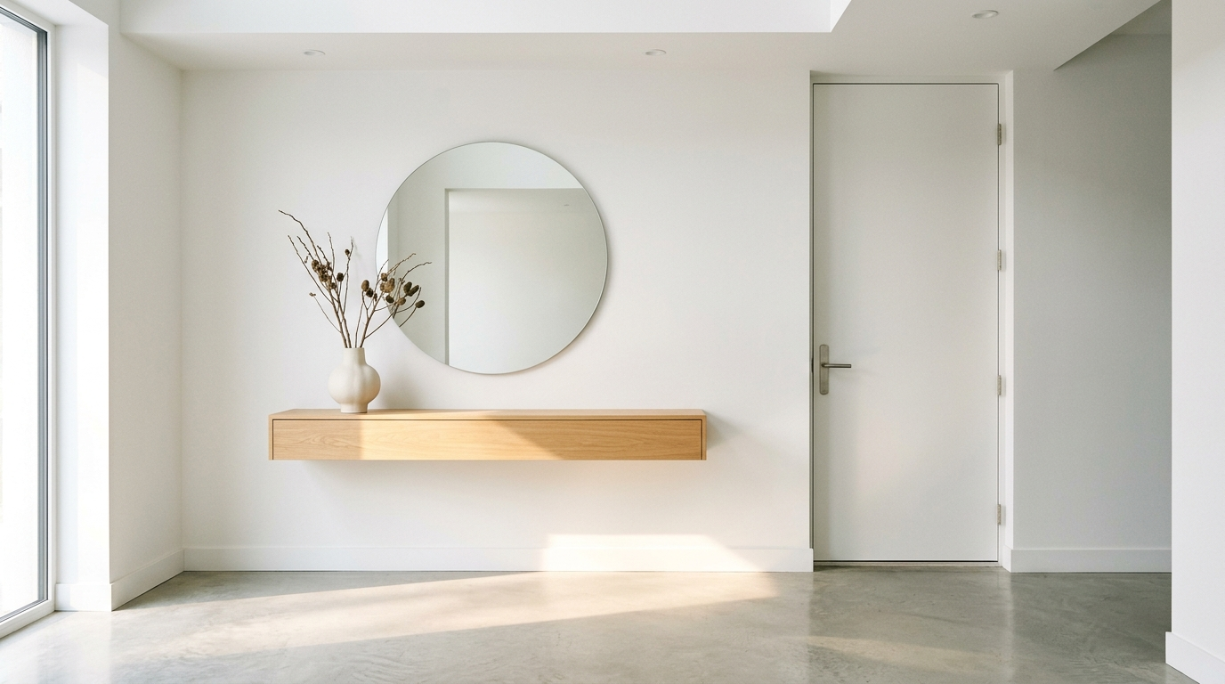
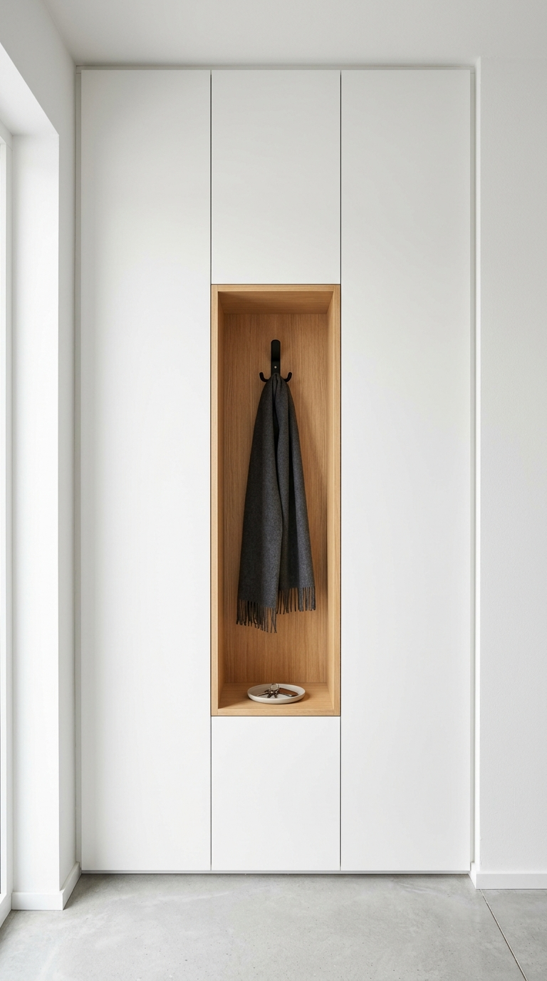
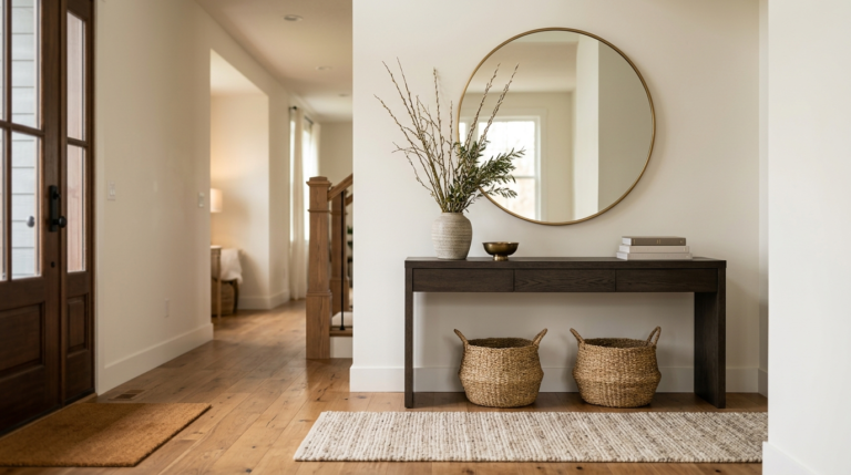
The Solution: Integrate hidden or seamlessly designed storage. A sleek, floating console table with a hidden drawer is a minimalist’s best friend. It provides a surface for a beautiful bowl to catch keys and mail, while the drawer hides less attractive necessities. If space allows, built-in cabinetry with push-to-open doors (eliminating hardware for a cleaner look) can hide coats, bags, and shoes completely from view. For smaller hallways, wall-mounted, sculptural hooks can serve as art when empty and practical coat storage when needed. The key is to design systems that accommodate your daily routine while maintaining a visually quiet environment.
Mistake 2: Poor Lighting Choices
Entryways and hallways are notoriously lacking in natural light. Relying on a single, harsh overhead light, or worse, leaving the space dim and shadowy, is a massive design error. Poor lighting makes a space feel small, uninviting, and clinical. In minimalist design, where architectural details and subtle textures are paramount, bad lighting flattens the room and drains its character. A dark foyer is the opposite of a welcoming entrance.
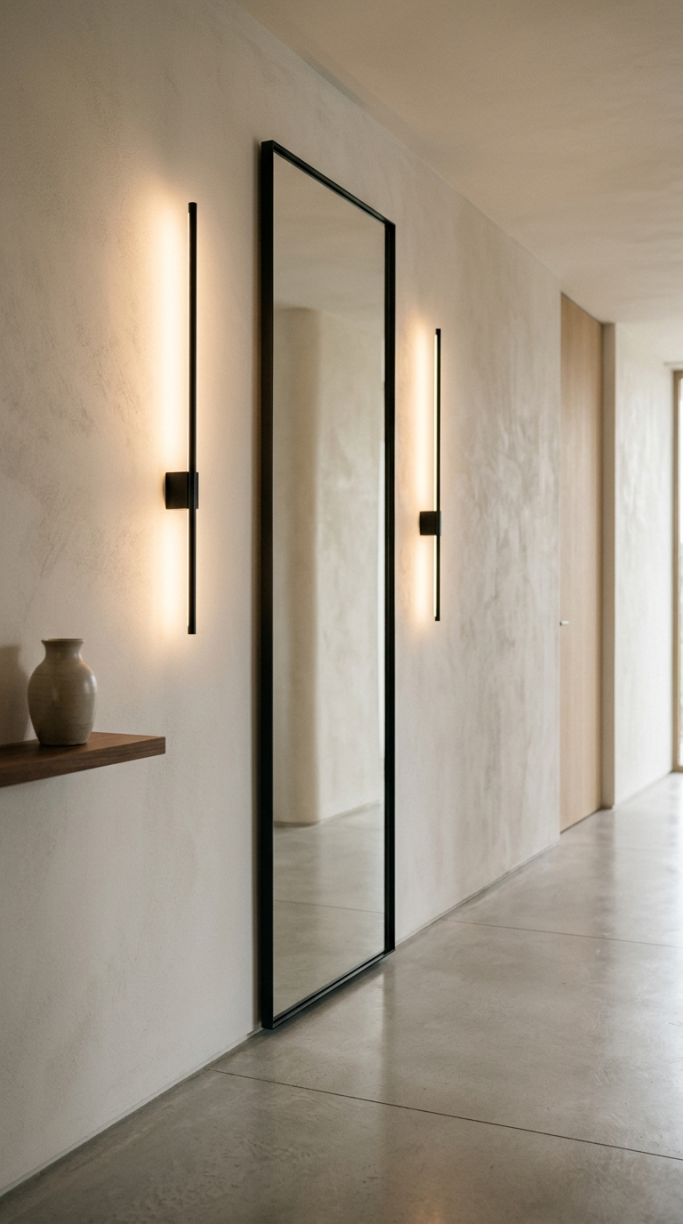
The Solution: Implement a layered lighting scheme. Start with a statement overhead fixture that fits the minimalist aesthetic—perhaps a large, simple paper lantern, a sleek linear pendant, or modern architectural flush mounts. But don’t stop there. Add ambient lighting through a modern, sculptural table lamp resting on your console, or install sleek wall sconces flanking a mirror. Ensure the bulbs you use emit a warm, inviting temperature (around 2700K to 3000K). The interplay of different light sources will cast beautiful shadows, highlight the clean lines of your furniture, and make the hallway feel expansive and warm.
Mistake 3: Getting the Scale Wrong
Scale and proportion are the invisible pillars of good design. A common mistake in entryways is using furniture or decor that is completely out of proportion with the room’s dimensions. Placing a tiny, delicate console table on a vast, wide wall looks comical and lost. Conversely, cramming a deep, heavy dresser into a narrow hallway makes the space feel instantly claustrophobic and creates a physical obstacle course for guests. Getting the scale wrong disrupts the visual flow and harmony essential to a minimalist space.
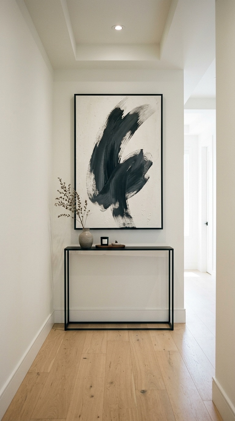
The Solution: Measure meticulously and visualize volume, not just footprint. In a narrow hallway, opt for slim-profile furniture. A console table with a depth of 10 to 12 inches is often sufficient. Consider furniture with exposed legs or floating designs, as seeing the floor underneath creates the illusion of more space. For wide foyers, ground the space with a substantial, solid piece, like a heavy stone or solid wood credenza. When selecting art or a mirror, go large. One oversized, dramatically scaled mirror leaning against the wall is far more effective and minimalist than a collection of small frames, and it brilliantly bounces light around the room.
Mistake 4: Forgetting a Focal Point
Because the entryway is a transitional space, people often forget that it needs to be anchored by a focal point. A hallway composed only of blank walls and a plain door feels like a waiting room, lacking personality and direction. Without a focal point, the eye wanders aimlessly, and the space feels incomplete. In minimalism, a focal point doesn’t mean something loud or chaotic; it means something intentional that draws you in.
The Solution: Create a compelling, minimalist focal point that immediately captures attention. This could be a stunning, oversized piece of abstract art hung above a sleek bench. It could be an architectural, large-scale round mirror with a thin matte black frame that anchors a minimalist console arrangement. Even a striking, tall indoor tree in a simple, textured planter can serve this purpose perfectly. The focal point should be the anchor around which the rest of your minimal elements are balanced. Keep the styling around the focal point sparse so it can truly shine and command the space.
Mistake 5: Neglecting the Floor
Often, designers focus so much on the walls and furniture that they forget the largest surface in the room: the floor. Leaving the floor bare, especially in a long hallway, can make the space feel echoey, sterile, and unfinished. Another mistake is using the wrong type of rug—either one that is too small, looking like a postage stamp, or one with a loud, busy pattern that clashes with the clean lines of the room.
The Solution: Use a runner or rug to add warmth, texture, and acoustic dampening, while strictly adhering to your minimalist palette. A vintage runner with muted, faded tones can add incredible character without adding clutter. Alternatively, a high-quality jute or sisal rug provides a beautiful, natural texture and high durability for a high-traffic area. Ensure the rug is properly sized; it should cover the majority of the walking area, leaving a consistent border of hard flooring exposed around the edges. This grounds the space and visually guides guests into the rest of the home.
Conclusion: The Art of Intentional Restraint
Designing a stunning, minimalist entryway is an exercise in intentional restraint. It requires a delicate balance between rigorous functionality and visual serenity. By avoiding these common mistakes—ignoring storage needs, settling for poor lighting, messing up scale, forgetting a focal point, and neglecting the floor—you can transform your foyer into a masterful example of modern design.
Remember that in a minimalist space, every single element matters because there is nowhere for bad design to hide. Take the time to curate your entryway thoughtfully. Invest in pieces that feature clean lines and high-quality materials. Ensure your storage solutions are as elegant as they are practical. When you succeed, walking through your front door will become a daily moment of deep satisfaction, a physical transition from the chaos of the outside world into the calm, ordered sanctuary of your beautifully designed home.
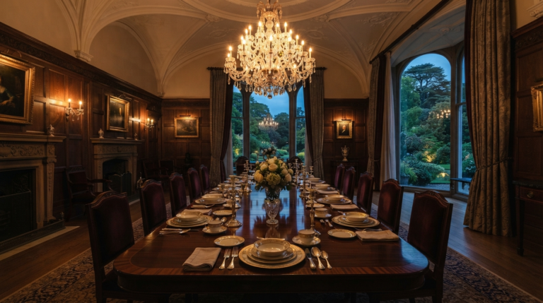
Transform your formal dining room into a luxurious sanctuary for sophisticated entertaining with these expert design tips and high-end decor inspiration.
Transform your hallway with these stunning rustic and cozy entryway ideas. Discover practical storage solutions and warm decor to welcome you home beautifully.
Is your entryway leaving a bad first impression? Learn the most common decor mistakes to avoid and how to design a stunning, functional foyer for your home.
Step into elegance with our ultimate guide to designing a luxury entryway. Discover sophisticated styling tips to create a truly unforgettable first impression.
Transform your house into a haven. Discover the art of designing intentional living spaces that promote comfort, connection, and true well-being in every room.
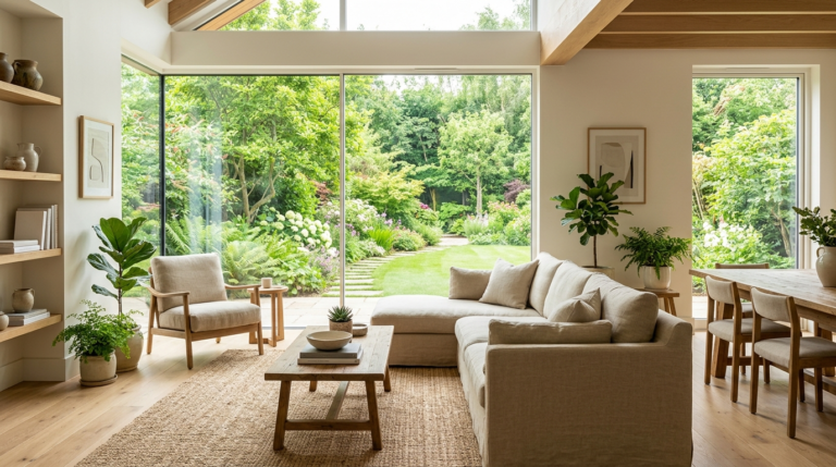
Stay ahead of the curve with our exclusive trend forecast for luxury living rooms. Discover the opulent textures, organic shapes, and premium elements defining modern elegance.