Designing and decorating a small kitchen is arguably one of the most challenging tasks in interior design. A kitchen is inherently a workhorse of a room; it demands massive functionality, substantial storage for appliances and food, and adequate surface area for food preparation. When you are forced to compress all of these vital requirements into a severely restricted footprint, every single design choice is magnified. The margin for error is incredibly thin. A poor decision regarding color, lighting, or cabinetry can instantly transform a cozy, functional cooking area into a claustrophobic, frustrating cave where cooking feels like a chore rather than a joy. However, having a small kitchen does not mean you have to sacrifice high-end style or efficiency. By understanding spatial dynamics and visual psychology, you can create a culinary space that feels open, airy, and much larger than its actual square footage. In this extensive guide, we are going to dissect the seven most common small kitchen decor mistakes that homeowners frequently make. More importantly, we will provide you with the exact, expert-approved solutions and design strategies you need to correct these errors, helping you maximize every single inch of your compact kitchen to create a breathtaking, highly functional heart of the home.
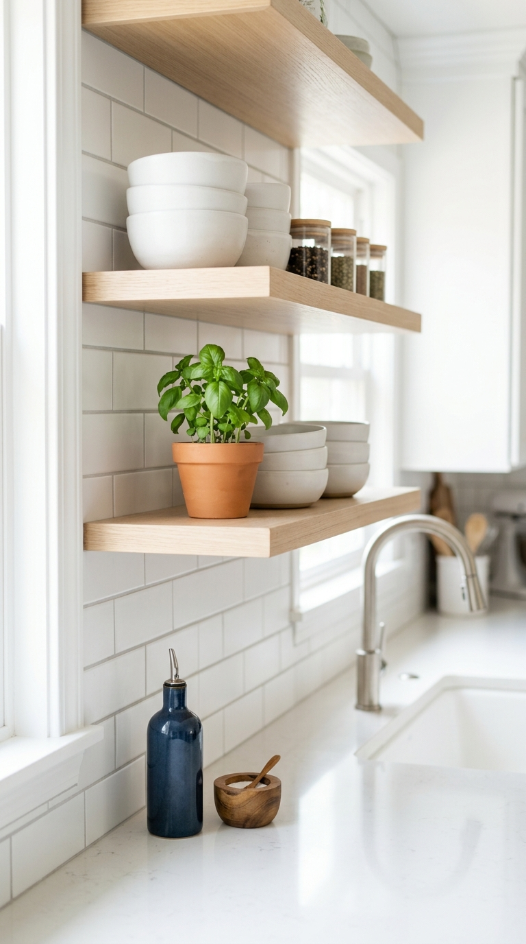
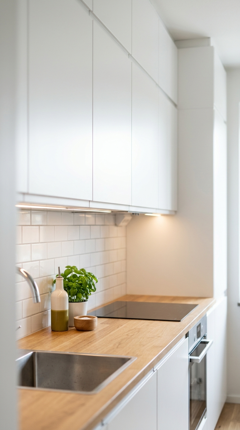
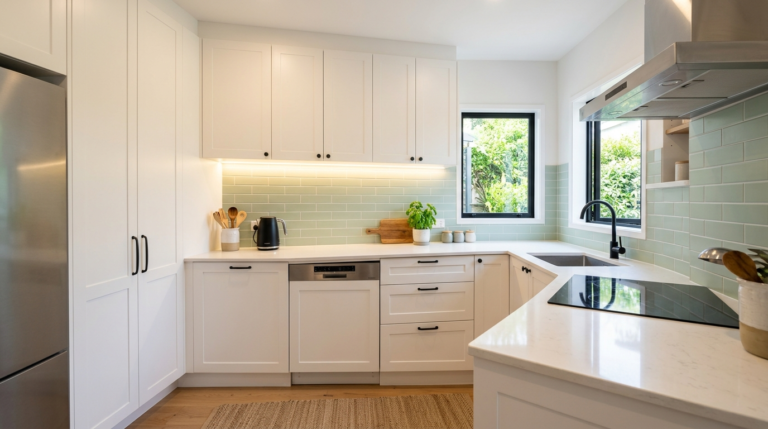
Mistake #1: Installing Heavy, Dark Upper Cabinetry
One of the most frequent and devastating mistakes made in small kitchen design is the installation of dark, massive, and visually heavy upper cabinets that extend all the way to the ceiling. While the desire to maximize closed storage space is entirely understandable in a tiny room, dark wood finishes like deep mahogany, espresso, or dark gray paint absorb all the available light. When placed at eye level and above, these dark, solid blocks loom over the space, bringing the visual ceiling down and making the walls feel as though they are closing in on you. The room instantly feels top-heavy, cramped, and decidedly unwelcoming.
The Solution: To counteract this claustrophobic effect, you must embrace lighter tones and visual breaks. If you are remodeling or painting, choose a bright, crisp white, a soft cream, or a pale pastel color for your upper cabinets. Light colors reflect both natural and artificial light, immediately expanding the perceived boundaries of the room. Even better, consider completely removing a section of your solid upper cabinets and replacing them with open floating shelves. Open shelving forces you to edit your belongings, displaying only beautiful plates or glassware, and pushes the visual wall back, adding tremendous depth to the room. If open shelving is too intimidating, replacing solid wooden cabinet doors with glass-front doors achieves a very similar, airy effect while still keeping your dishes protected from dust.
Mistake #2: Ignoring the Power of Layered Lighting
A single, glaring flush-mount ceiling light or a harsh fluorescent tube in the center of the ceiling is the absolute death knell for a small kitchen. This type of singular, centralized lighting casts deep, heavy shadows under the upper cabinets, precisely over your countertops where you actually need the light the most to prep food safely. Furthermore, inadequate lighting makes a small space feel dingy, depressing, and even smaller than it physically is. Dark corners recede visually, shrinking the footprint of the room.
The Solution: You must implement a comprehensive, layered lighting scheme consisting of three distinct types of light: ambient, task, and accent. First, improve the ambient lighting by installing sleek recessed LED lights evenly distributed across the ceiling to eliminate the center-shadow effect. Second, and most crucially for a small kitchen, you must install under-cabinet task lighting. High-quality LED strip lights mounted directly under the upper cabinets flood your countertops with bright, focused light, making food prep a joy and visually expanding the space by illuminating the dark alcoves. Finally, add accent lighting. A pair of delicate, beautiful pendant lights suspended over a small peninsula or a sink not only provides extra illumination but also serves as a stunning visual focal point that draws the eye upward, emphasizing the vertical height of the room.
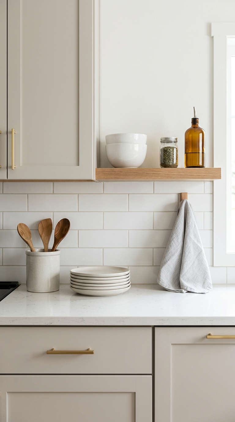
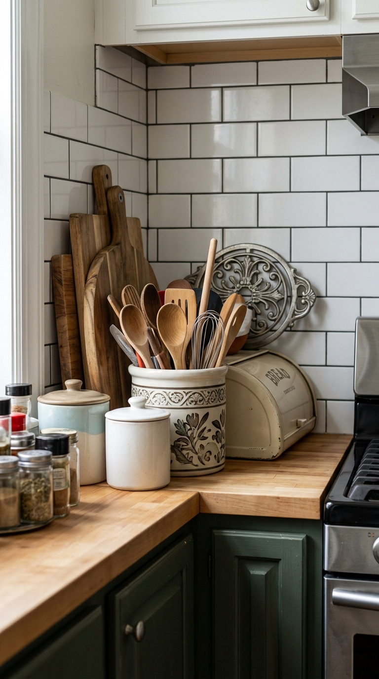
Mistake #3: Cluttering the Precious Countertops
In a small kitchen, countertop real estate is the most valuable commodity you possess. The fastest way to make a tiny kitchen feel chaotic, dirty, and overwhelmingly small is to cover every inch of the counter space with appliances, utensil crocks, mail, cutting boards, and decorative trinkets. When the eye cannot see any continuous, empty horizontal surfaces, the brain interprets the space as chaotic and cramped. Visual clutter is the ultimate enemy of the small kitchen.
The Solution: You must ruthlessly adopt a minimalist approach to your countertops. The golden rule is: if you do not use an appliance every single day, it does not deserve a permanent spot on the counter. The bulky stand mixer you use once a month for baking needs to be stored in a lower cabinet or on a sturdy pantry shelf. The toaster and the blender should be tucked away after use. For the items you must keep out, invest in clever vertical storage solutions. Install a magnetic knife strip on the wall instead of using a bulky wooden knife block that eats up counter space. Hang your most frequently used pots and pans from a stylish ceiling rack or a sturdy wall-mounted rail system. Keep only the absolute essentials—perhaps a beautiful coffee maker and a small, curated tray with salt, pepper, and olive oil—on display. Exposing as much bare countertop as possible is the single most effective trick for faking a larger kitchen.
Mistake #4: Interrupting the Visual Flow with Choppy Flooring
Flooring is often an afterthought in kitchen design, but in a small space, it plays a massive role in how the size of the room is perceived. A major mistake is using small, busy, heavily patterned tiles with thick, contrasting grout lines. This chops up the floor visually into tiny squares, drawing the eye down and emphasizing the limited square footage. Similarly, abruptly changing the flooring material right at the threshold of the kitchen—for example, going from hardwood in the living room to tile in the small kitchen—creates a harsh visual boundary that forcefully defines and limits the kitchen’s footprint.
The Solution: The goal is to create a seamless, uninterrupted visual flow that tricks the eye into believing the space stretches on further than it does. If possible, run the exact same flooring from your adjoining living or dining area straight through into the kitchen. This continuity blurs the boundaries of the rooms, making them feel like one large, cohesive space. If you must use different flooring, opt for large-format tiles (such as 12×24 inches or larger) and use a grout color that closely matches the tile to minimize the grid effect. Alternatively, light-colored, wide-plank hardwood or luxury vinyl planks laid parallel to the longest wall will draw the eye out, elongating the room and creating a wonderful sense of spaciousness.
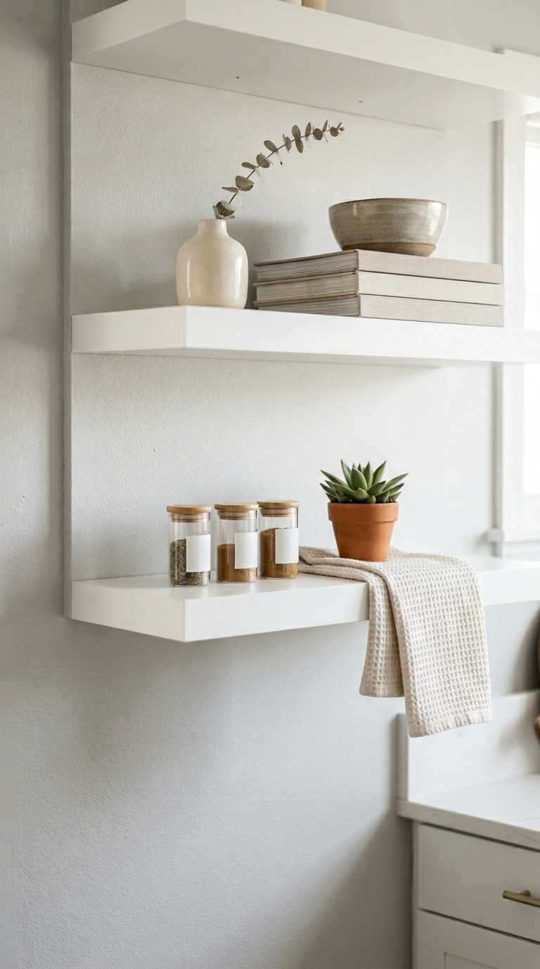
Mistake #5: Wasting the Vertical Space Above Cabinets
Take a look at your current small kitchen. Is there a gap of twelve to eighteen inches of empty wall space between the top of your upper cabinets and the ceiling? In a sprawling, massive kitchen, this gap is acceptable. In a tiny kitchen, leaving this vertical space entirely unutilized is a severe design crime. Not only does it rob you of cubic feet of potential storage, but it also creates a dark, dusty void that visually truncates the room, making the ceilings feel significantly lower than they actually are.
The Solution: The best and most high-end solution is to install cabinetry that extends completely flush to the ceiling. This draws the eye all the way up, emphasizing the full height of the room, and provides an enormous amount of storage for seasonal items, holiday platters, or bulky equipment you rarely use. If extending the cabinets is not within your budget, you must find a way to elegantly utilize that gap. Do not just throw random, dusty artificial plants up there. Instead, install a beautiful floating shelf directly above the cabinets to display a curated, color-coordinated collection of ceramic vases or large, attractive serving bowls. Alternatively, use uniform, high-quality woven baskets to store extra paper goods or lightweight supplies. By filling this space deliberately and beautifully, you maximize your storage and elevate the room’s height.
Mistake #6: Choosing Oversized, Bulky Hardware and Appliances
Scale and proportion are everything in interior design. Placing massive, professional-grade, chunky appliances and thick, heavy cabinet hardware into a diminutive kitchen is like putting giant, clunky boots on a delicate ballerina; it ruins the balance and makes the space feel completely overwhelmed. A massive, double-door refrigerator that juts out six inches past the countertops creates an immediate bottleneck, physically blocking the traffic flow and dominating the visual landscape of the room.
The Solution: You must strictly adhere to the scale of the room. When shopping for appliances, look for European-style or specifically designated ‘apartment-sized’ or ‘slimline’ models. A slender, counter-depth refrigerator that sits perfectly flush with your cabinetry instantly streamlines the entire wall, eliminating awkward physical barriers. Look for compact, 18-inch dishwashers instead of the standard 24-inch models. Apply the same rigorous logic to your cabinetry hardware. Swap out thick, heavy, ornate handles or large wooden knobs for sleek, slim, low-profile metallic pulls or minimalist edge-pulls. These small, subtle touches significantly reduce the visual weight in the room, keeping the overall aesthetic clean, sharp, and highly tailored to the compact dimensions.
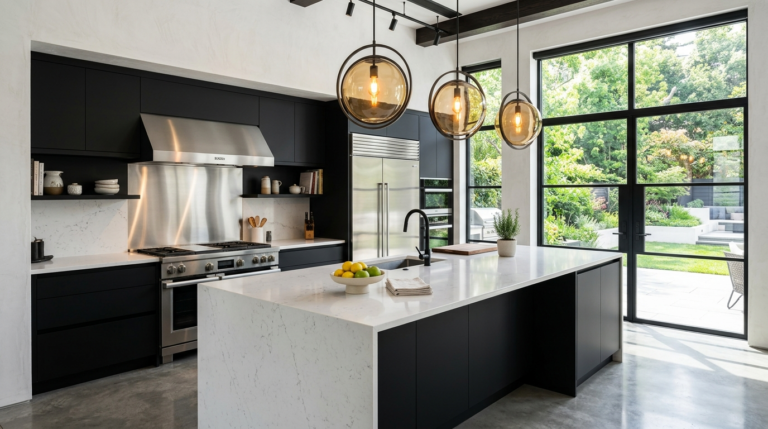
Mistake #7: Being Afraid of Bold, Reflective Finishes
A persistent, yet completely misguided, myth in the design world is that small spaces must be decorated exclusively with flat, matte, neutral colors to avoid looking ‘too busy.’ This fear leads homeowners to design flat, uninspired, completely matte kitchens that lack any depth or personality. Matte finishes absorb light, which, as we have established, is the enemy of a small space. A room devoid of light reflection feels flat, boxy, and lifeless.
The Solution: You must intentionally introduce reflective surfaces to bounce light around the room, which creates an optical illusion of depth and expanded space. The backsplash is the perfect canvas for this strategy. Instead of matte painted drywall or rough natural stone, install high-gloss, glazed ceramic tiles. Classic white subway tiles with a glossy finish act like hundreds of tiny mirrors, capturing the under-cabinet lighting and reflecting it back into the room. Mirrored or metallic backsplashes, when used tastefully, can literally double the visual depth of the counter space. Furthermore, consider incorporating stainless steel appliances, polished chrome or unlacquered brass faucets, and even high-gloss paint for the ceiling. By strategically placing these reflective elements, you create a dynamic, luminous environment that feels infinitely more expansive, sophisticated, and brilliant than its square footage suggests.
Discover the most frequent kitchen design mistakes and how to avoid them. Learn expert tips on layout, lighting, and storage to create your dream dining space.
Discover stunning, easy-to-implement kitchen and dining room ideas. Elevate your space with cozy seating, modern lighting, and smart storage solutions.
Struggling with a cramped cooking space? Discover the most common small kitchen decor mistakes and learn how to maximize your storage, light, and style.
Discover the latest sustainable design trends for your kitchen and dining areas. Explore organic materials, minimalist layouts, and earthy color palettes.
Are you planning a modern kitchen remodel? Avoid these costly and frustrating design mistakes to ensure your new culinary space is both beautiful and functional.
Is your kitchen feeling cramped or inefficient? Discover the most common layout mistakes and learn how to fix them for a functional and beautiful space.