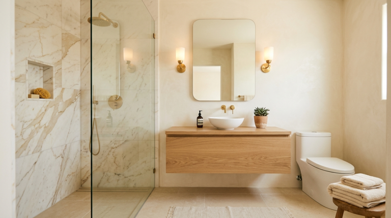
Designing a small bathroom can feel like solving a complex puzzle. With limited square footage, every single choice matters, from the color of the paint to the placement of the vanity. When working with compact spaces, it is incredibly easy to make design decisions that unintentionally make the room feel even smaller, darker, and more cluttered than it actually is. However, embracing a minimalist and clean aesthetic can completely transform your tiny washroom into a serene, spa-like retreat. It is all about maximizing efficiency, playing with light, and being incredibly intentional with your decor. If your small bathroom is feeling cramped or chaotic, you might be falling victim to some of the most common interior design pitfalls.In this comprehensive guide, we are going to dive deep into the top seven decor mistakes people frequently make when designing small bathrooms. More importantly, we will provide you with actionable, minimalist-approved solutions to fix them. Whether you are planning a full gut renovation or just looking for a weekend refresh with a few clever tweaks, avoiding these errors will help you unlock your bathroom’s full potential. Let us explore how you can create an illusion of grandeur in the most modest of spaces by understanding the delicate balance of form, function, and visual weight.
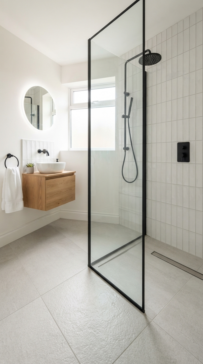
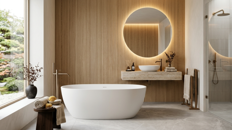
Mistake 1: Relying on Dark, Heavy Color PalettesOne of the most frequent mistakes homeowners make in small bathrooms is opting for dark, heavy colors on the walls, floors, and cabinetry. While dark hues like deep navy, charcoal, or emerald green can look incredibly chic and moody in larger, well-lit spaces, they tend to absorb whatever little light exists in a compact bathroom. This creates a cave-like atmosphere, bringing the walls visually closer together and making the ceiling feel lower. When your goal is to make a small room feel expansive, dark colors work against you.The Minimalist Solution: The key to opening up a small bathroom is to harness the power of light reflectance. Stick to a predominantly light and neutral color palette. Crisp whites, soft off-whites, pale grays, and gentle warm beiges are your best friends. These colors bounce natural and artificial light around the room, instantly making the space feel larger and airier. If you crave a bit of contrast or depth, introduce it through subtle textures rather than heavy colors. For example, a white fluted tile or a matte light-gray stone floor adds architectural interest without weighing down the room. If you must incorporate color, do so sparingly—perhaps through a sleek, light oak wood vanity to bring in warmth, or a single piece of minimalist art.
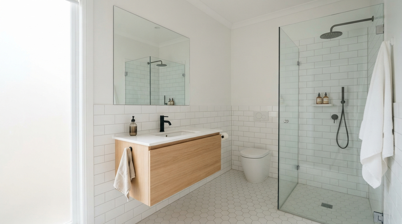
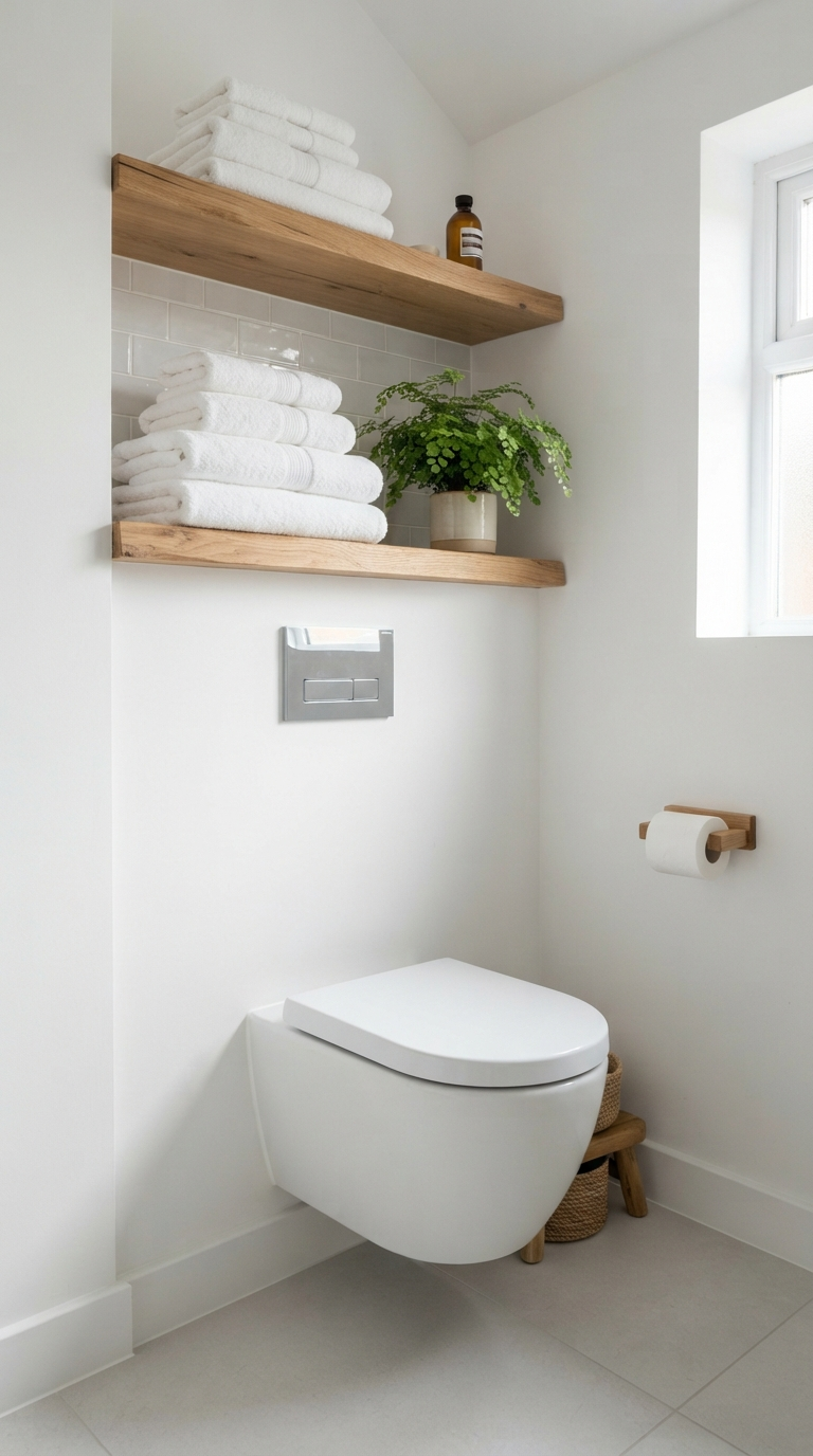
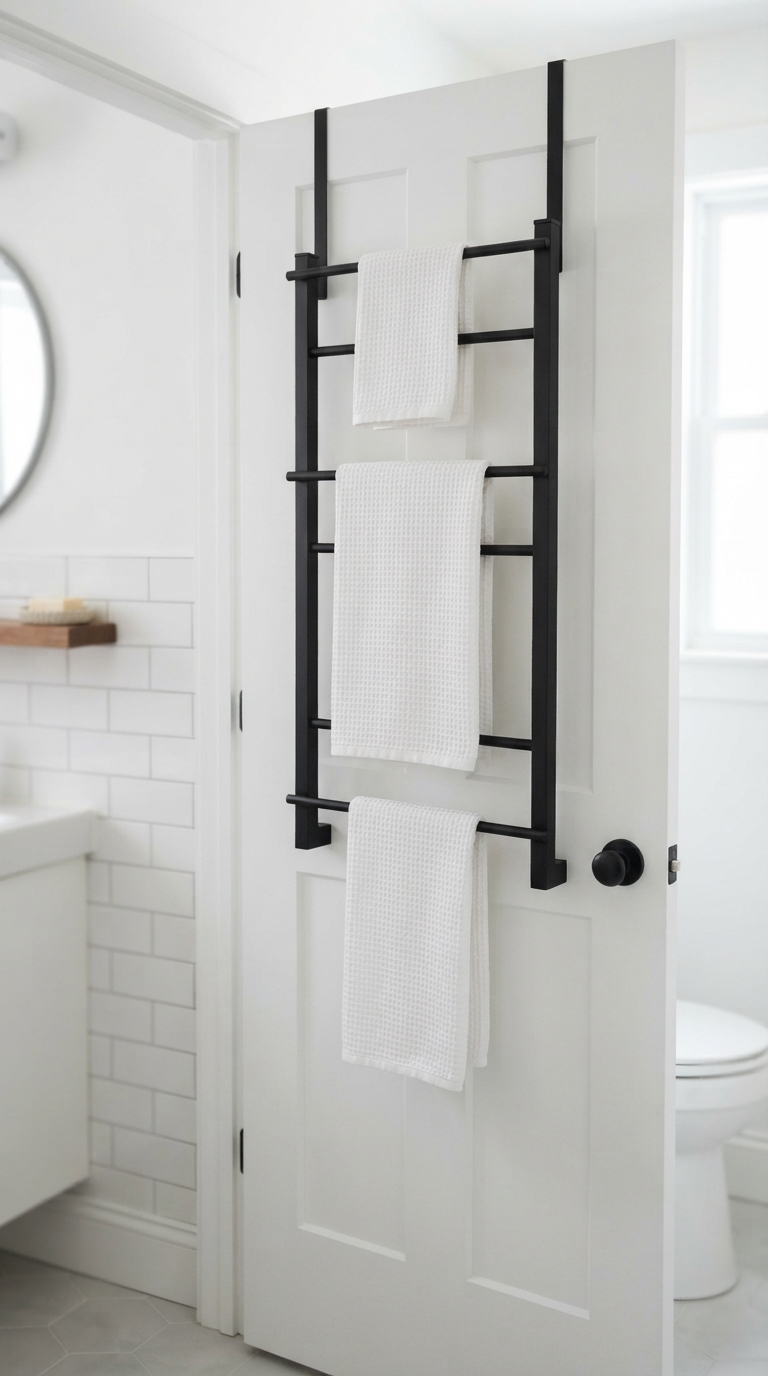
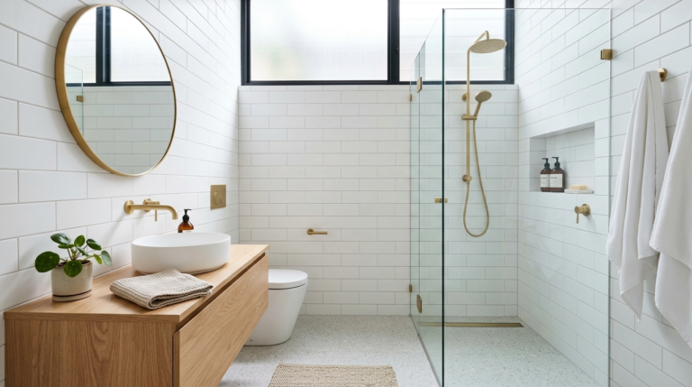
Mistake 2: Ignoring Vertical SpaceWhen floor space is at a premium, it is a massive oversight to ignore the real estate on your walls. Many people try to cram all their storage needs into a single, bulky vanity or a freestanding cabinet on the floor, leaving the upper half of the walls completely bare. This not only eats up your precious walking area but also draws the eye downward, emphasizing the limited footprint of the room. Failing to utilize vertical space is essentially leaving money on the table when it comes to small bathroom design.The Minimalist Solution: Draw the eye upward to create the illusion of a higher ceiling while simultaneously solving your storage woes. Install sleek, floating shelves above the toilet or next to the mirror to hold neatly folded towels, minimalist glass jars for cotton swabs, or a trailing pothos plant. Consider investing in a tall, narrow medicine cabinet that is recessed into the wall for a flush, seamless look. Wall-mounted organizers and hooks for towels, rather than a bulky floor rack, will also keep the floor clear. The more floor space you can see, the bigger the room will feel. A floating vanity is another excellent way to utilize vertical mounting to expose the floor underneath, giving the room a much lighter, less anchored appearance.
Mistake 3: Poor and Inadequate LightingLighting is the unsung hero of interior design, and in a small bathroom, it can make or break the entire aesthetic. A common mistake is relying on a single, harsh overhead light fixture. Overhead lighting creates heavy shadows, particularly around the vanity area, which is unflattering and makes the corners of the room recede into darkness. When corners are dark, the boundaries of the room feel closer, shrinking the perceived size of the space. Furthermore, heavy, ornate light fixtures can physically intrude into the room, making a low ceiling feel even lower.The Minimalist Solution: Layering your lighting is essential. You want to eliminate shadows and create a bright, even wash of light. Start with a sleek, low-profile LED flush mount for the ceiling to provide general ambient light. Then, add task lighting at the vanity. The absolute best setup for a small bathroom is vertical sconces placed on either side of the mirror at eye level. This provides cross-illumination that wipes out shadows on the face and makes the room feel exceptionally bright. If you don’t have the wall space for sconces, a streamlined horizontal LED bar above the mirror works well. Additionally, consider backlit mirrors; they provide a soft, glowing halo of light that feels incredibly modern and clean, eliminating the need for bulky exterior fixtures altogether.
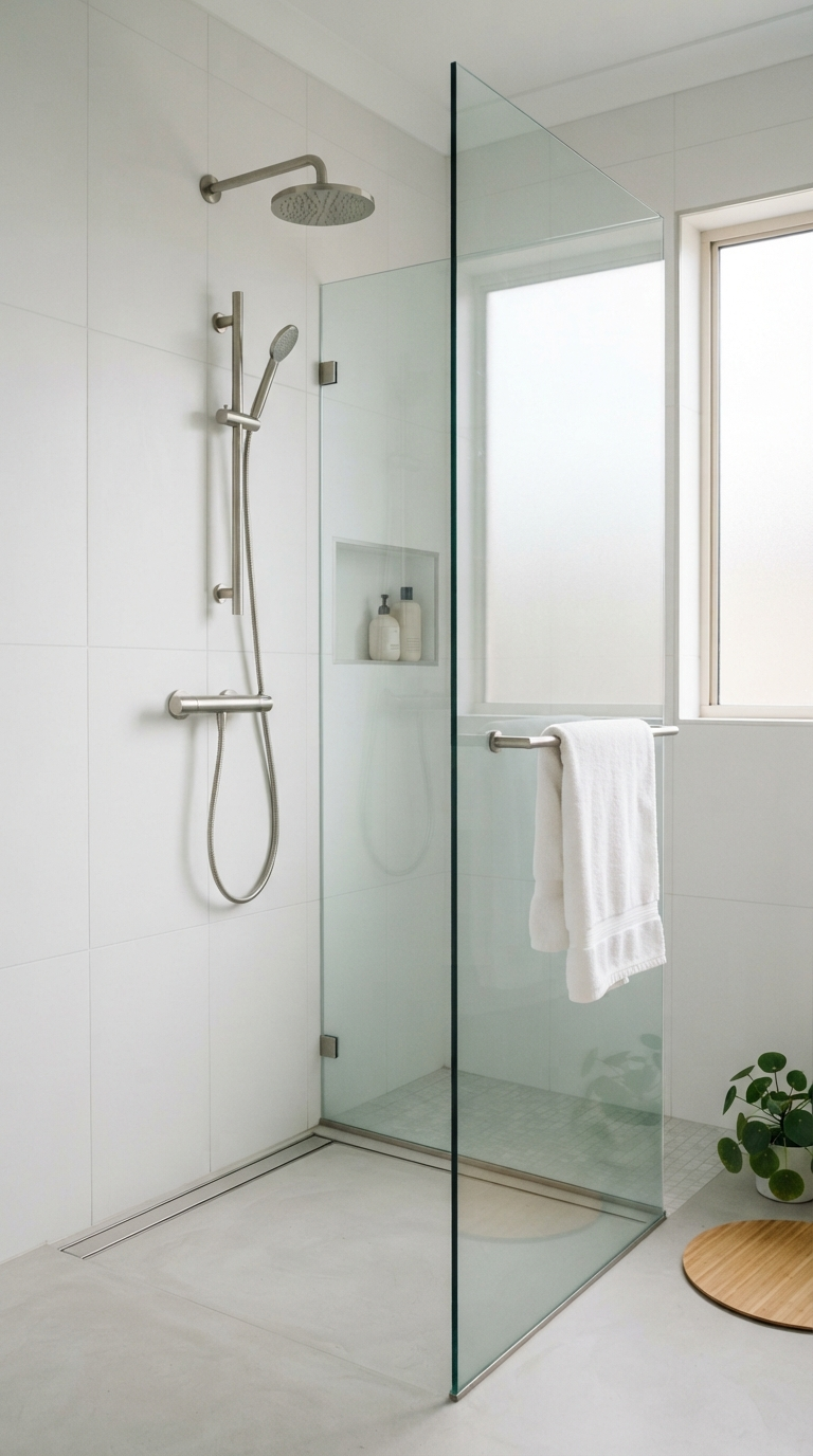
Mistake 4: Choosing Oversized, Bulky FixturesIt is easy to fall in love with a massive, ornate double vanity or a deep, clawfoot tub when browsing showrooms. However, forcing oversized fixtures into a micro-bathroom is a recipe for disaster. A bulky vanity with heavy, solid doors and a thick countertop will immediately dominate the room, obstructing the flow of traffic and making the space feel cramped and claustrophobic. Similarly, a massive, thick-rimmed toilet or a bulky, heavily framed shower enclosure visually chops up the room, interrupting the eye’s natural sweep across the space.The Minimalist Solution: Scale is everything. You must choose fixtures that are proportionate to the square footage you actually have, not the square footage you wish you had. Opt for a sleek, wall-mounted floating vanity. By exposing the floor underneath, you trick the brain into perceiving more continuous square footage. If you need a floor-standing vanity, choose one with slender legs and an open bottom shelf rather than a solid, blocky cabinet. Swap a chunky toilet for a compact, round-front model, or even a wall-hung toilet if your plumbing allows. For the shower, ditch the heavy metal frames and frosted glass in favor of a frameless, clear glass enclosure. Clear glass acts like an invisible barrier, allowing the eye to travel all the way to the back wall of the shower, making the entire bathroom feel cohesive and much larger.
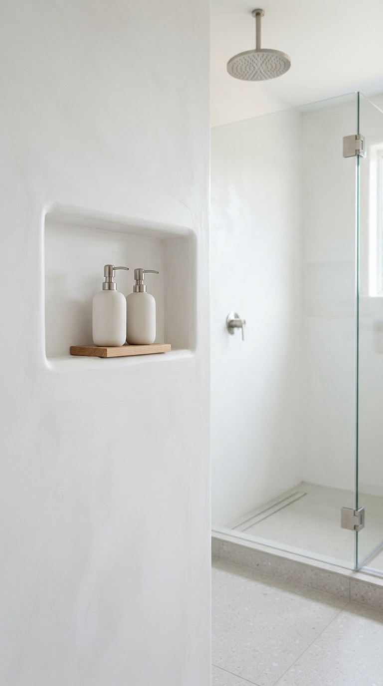
Mistake 5: Using Tiny, Busy Tile Patterns EverywhereThere is a persistent myth in interior design that small rooms require small tiles. This couldn’t be further from the truth. Using tiny mosaic tiles—especially those with busy patterns or high-contrast grout lines—all over the floors and walls creates visual clutter. Your eye is forced to process hundreds of tiny grid lines, which makes the space feel frantic and closed in. A hyper-textured, busy surface distracts from the clean lines needed to make a small space feel open and serene.The Minimalist Solution: To create a calm, expansive feel, use large-format tiles. Fewer grout lines mean less visual interruption. A large 12×24 inch or even 24×24 inch tile on the floor creates a smooth, almost seamless surface that visually stretches the room. If you use the same large tile on the floor and run it straight up the walls of the shower enclosure, you blur the boundaries between the different areas of the room, creating an optical illusion of endless space. If you absolutely love the look of small tiles, reserve them for a small, contained accent feature, like a recessed shower niche. For the main surfaces, stick to clean, oversized tiles with grout that closely matches the tile color to minimize the grid effect.
Mistake 6: Over-Accessorizing and Cluttered CountersIn a small bathroom, clutter is the ultimate enemy. Leaving out your toothbrush, toothpaste, multiple bottles of lotion, hair styling tools, and decorative knick-knacks on a tiny vanity counter instantly creates visual chaos. A cluttered surface makes the entire room feel messy, chaotic, and decidedly smaller. Minimalist design is rooted in the philosophy of “a place for everything, and everything in its place.” When every horizontal surface is covered, the eye has nowhere to rest.The Minimalist Solution: Adopt a strict “clear counter” policy. Edit down your daily products to only the absolute essentials. Invest in smart, hidden storage solutions. Use drawer dividers to organize makeup and toiletries out of sight. Install a recessed medicine cabinet to hide toothbrushes and skincare products behind a mirror. If you must leave items out, decant them into beautiful, uniform, minimalist dispensers. A matching set of matte black or clear glass soap and lotion dispensers looks intentional and chic, unlike a jumble of branded plastic bottles. Keep decorative accessories to an absolute minimum—perhaps a single, sleek vase with a solitary green leaf, or a beautifully scented candle. The negative space on your countertops is just as important as the items you place on them.Mistake 7: Neglecting the Entryway and Door SweepFinally, a frequently overlooked mistake in small bathroom design is the door itself. A standard inward-swinging door requires a massive arc of clearance inside the bathroom. This dead zone cannot be used for fixtures, storage, or even standing comfortably. In a truly tiny bathroom, an inward-swinging door can actually bump into the toilet or the vanity, creating a daily annoyance and severely limiting your layout options.The Minimalist Solution: If your layout permits, change the door swing. Hanging the door so it swings outward into the hallway instantly reclaims crucial square footage inside the bathroom. If an outward swing isn’t possible due to hallway traffic, consider a pocket door. A pocket door slides seamlessly into the wall, completely eliminating the door swing radius. This allows you to utilize every single inch of the bathroom’s interior footprint. The sleek, flush mechanism of a pocket door also perfectly aligns with a clean, minimalist aesthetic, removing bulky hinges and visible framing from the interior space. By rethinking the entry point, you can dramatically optimize the flow and feel of your compact oasis.
Discover the most enchanting and whimsical bathroom trends of the year. Transform your ordinary washroom into a magical oasis with these top design tips!
Transform mundane chores into a joyful experience with these imaginative, whimsical DIY ideas for your bathroom and laundry room. Magic is in the details!
Transform your cramped small bathroom into a luxurious oasis with these expert design tips, clever storage solutions, and stylish space-saving hacks today.
Avoid costly design errors with our guide to common bathroom decor mistakes. Learn how to transform your bathroom into a functional, beautiful spa oasis.
Struggling with a cramped bathroom? Uncover the most common small bathroom decor mistakes and learn expert interior design solutions to make your space feel huge.
Unlock the secrets to maximizing space and elevating style in a compact bathroom. This step-by-step guide helps you create a premium, luxurious oasis at home.