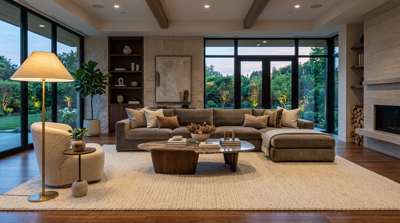
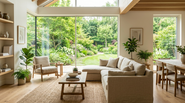
The living room is the true nucleus of the modern home. It is the multi-purpose arena where we entertain guests, unwind after exhausting days, enjoy movie nights with family, and sometimes even work or study. Because it serves so many vital functions, the design and layout of the living room are of paramount importance. Yet, even those with a keen eye for aesthetics frequently stumble into common interior design pitfalls that compromise the comfort and flow of the room. A beautifully designed living room is not just about expensive furniture; it is about harmony, proportion, and creating a space that feels intuitively welcoming. In this comprehensive guide, we are going to dissect the seven most common living room decor mistakes, explain why they disrupt the harmony of your space, and provide detailed, actionable solutions to elevate your home’s design today.Mistake 1: The ‘Floating Island’ Rug SyndromePerhaps the most prevalent and visually jarring mistake in living room design is the incorrect sizing of area rugs. Many homeowners, perhaps trying to save money or simply underestimating the scale of their room, purchase rugs that are far too small. The result is the ‘floating island’ effect, where a tiny rug sits isolated in the center of the room, with all the furniture pushed back against the walls, completely disconnected from the rug. This immediately shrinks the visual footprint of the room and makes the furniture arrangement feel disjointed and unanchored.The Solution: The cardinal rule of living room rugs is that bigger is almost always better. An area rug is meant to define the seating zone and anchor the furniture. To achieve a cohesive look, all of your major seating pieces—the sofa, loveseat, and accent chairs—should ideally have all four legs resting on the rug. If that is not possible due to budget or room constraints, a perfectly acceptable alternative is the ‘front legs only’ rule. Ensure that at least the front two legs of every seating piece in the grouping are resting generously on the rug. This instantly connects the pieces, grounding the space and making the room feel significantly larger and more intentionally designed. When in doubt, scale up to an 8×10 or 9×12 rug instead of a 5×8.
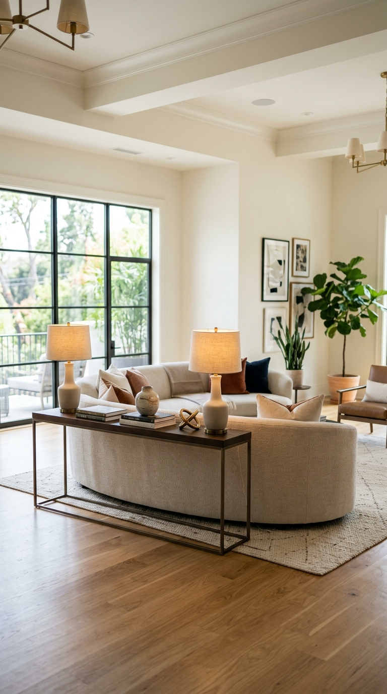
Mistake 2: Banishing All Furniture to the PerimeterThere is a deeply ingrained instinct in many people to push every piece of furniture—sofas, chairs, bookshelves, consoles—flat against the walls of the living room. The logic seems to be that this will maximize the empty floor space in the center, thereby making the room feel larger. However, in reality, this strategy achieves the exact opposite. Pushing furniture to the perimeter creates a dead, awkward void in the center of the room, making conversation incredibly difficult and giving the space a sterile, waiting-room atmosphere. It strips the room of intimacy and disrupts the flow of energy.The Solution: Embrace the concept of ‘floating’ your furniture. Pull your sofa and chairs away from the walls to create a dedicated, intimate conversation area in the center of the room. Even leaving just twelve to eighteen inches of breathing room between the back of the sofa and the wall can create an illusion of greater space and depth. If you have a large, open-concept living area, floating the furniture is absolutely essential to define the boundaries of the ‘living room’ zone. Use the back of a floating sofa to act as a visual divider, perhaps placing a sleek console table behind it for added storage and a place for table lamps. This arrangement fosters intimacy, improves traffic flow, and immediately elevates the room to a designer level.
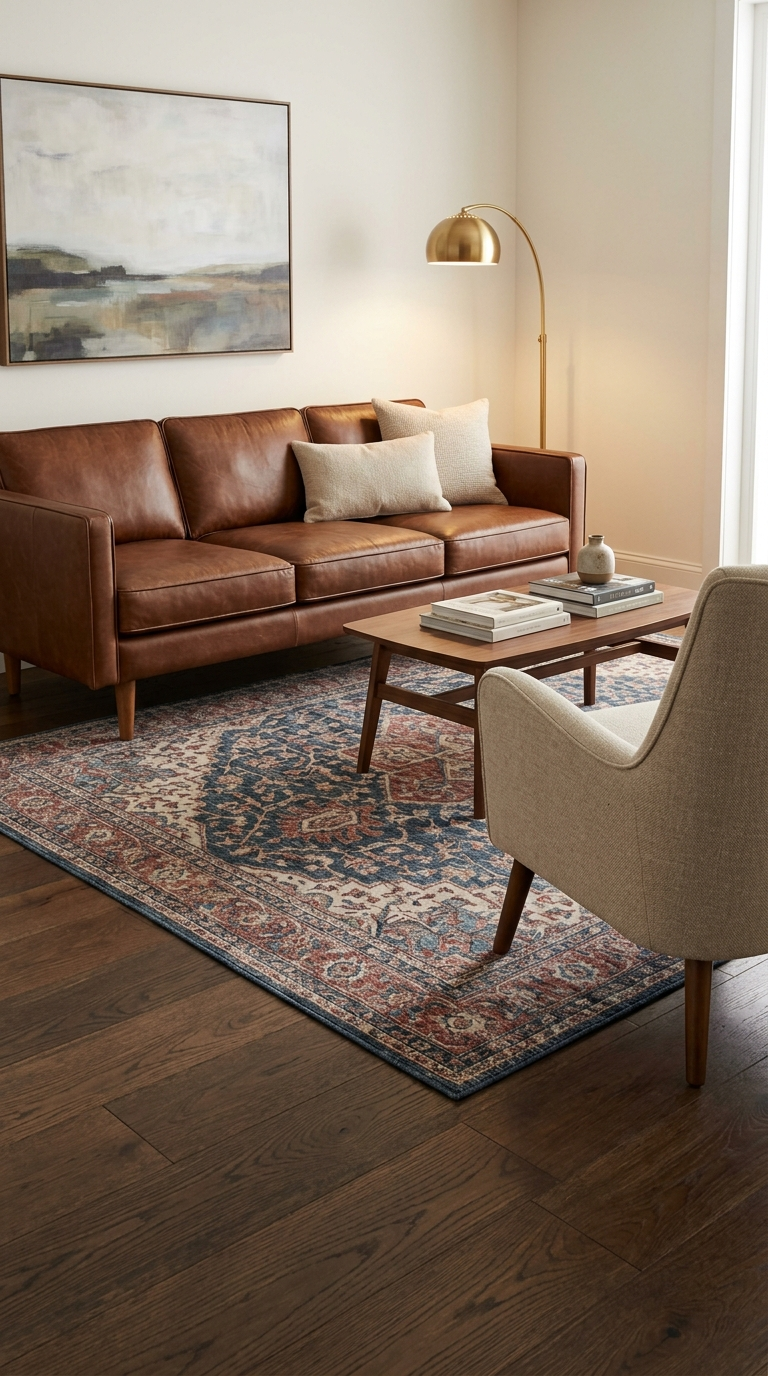
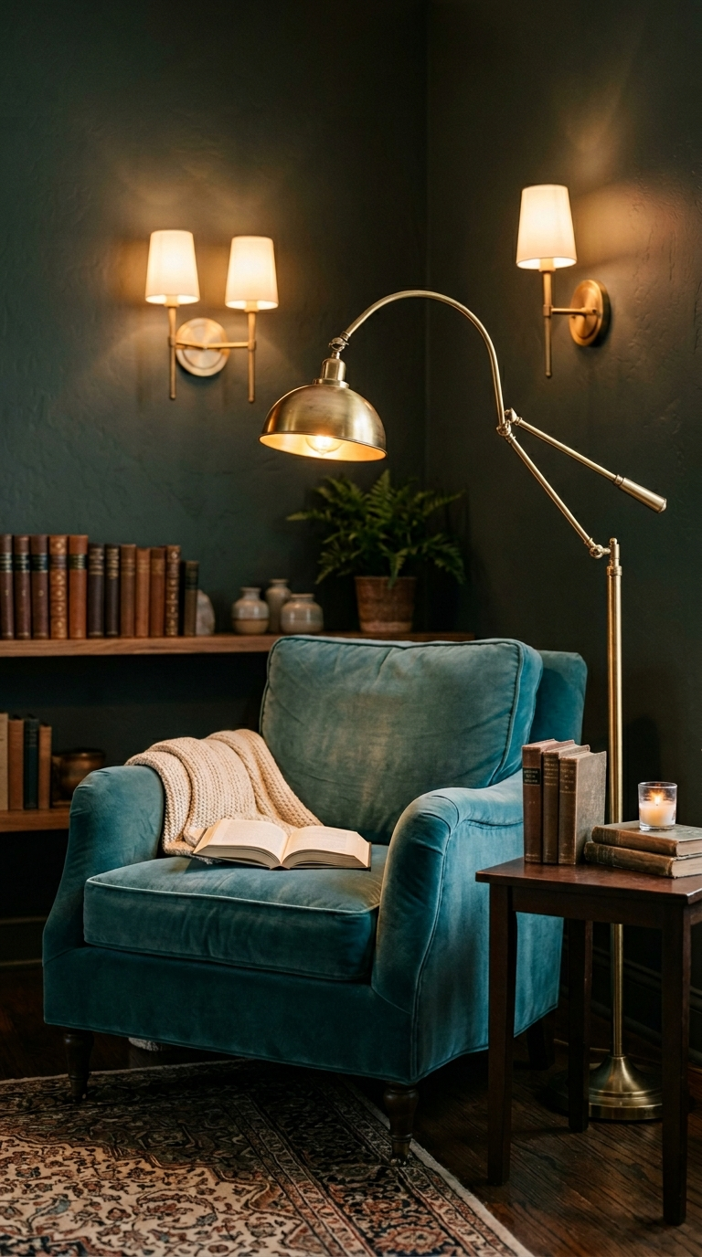
Mistake 3: Relying Exclusively on Overhead LightingLighting is the unsung hero of interior design; it dictates the mood, highlights architectural features, and fundamentally alters how colors and textures are perceived. A major, yet incredibly common, mistake is relying solely on harsh, overhead lighting—such as standard recessed ceiling cans or a single central ceiling fan fixture. This type of lighting casts unflattering shadows, washes out the room’s color palette, and creates a sterile, interrogation-room vibe that is the absolute antithesis of a cozy, relaxing living room environment.The Solution: To create a truly inviting living room, you must implement a layered lighting design scheme. This involves using three distinct types of lighting: ambient, task, and accent. Start by installing dimmer switches on your overhead ambient lights so you can control their intensity. Next, introduce task lighting where needed—a beautiful arched floor lamp curving over a reading chair, or a pair of elegant table lamps flanking the sofa. Finally, use accent lighting to add depth and drama. This could be a small picture light highlighting a piece of art, wall sconces framing the fireplace, or even subtle LED strip lighting behind a media console. The interplay of multiple, softer light sources at different heights creates a rich, warm, and inviting atmosphere that a single overhead bulb could never achieve.
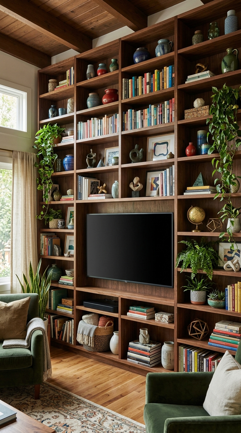
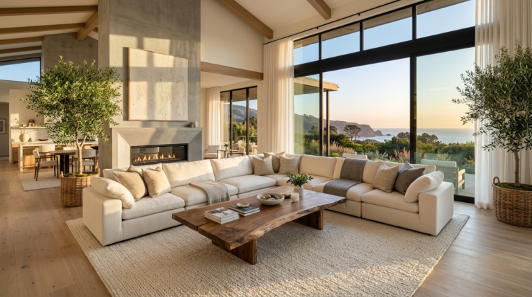
Mistake 4: Allowing the Television to Dominate the SpaceIn the modern era, the television has become a massive, monolithic black rectangle that threatens to swallow the design aesthetic of any living room. While the TV is undeniably a central hub of entertainment, allowing it to become the singular focal point of the room is a significant design misstep. When all furniture points directly at a massive blank screen, the room loses its conversational purpose and feels more like a home theater than a living space. Furthermore, a large black rectangle can be a visual eyesore that clashes with softer textures and carefully chosen color palettes.The Solution: You do not need to banish the TV, but you must integrate it thoughtfully. If the room has a natural architectural focal point—like a beautiful fireplace or a stunning picture window with a view—arrange your primary seating to appreciate that feature first, allowing the TV to be a secondary focal point on an adjacent wall. If the TV must be the primary focus, camouflage it. Frame the television with built-in bookshelves filled with colorful books, art, and decorative objects to draw the eye away from the screen. Alternatively, invest in modern televisions that display museum-quality art when not in use, or house the TV inside a beautiful armoire or behind sliding barn doors. The goal is to make the technology serve the room, rather than letting the technology dominate it.
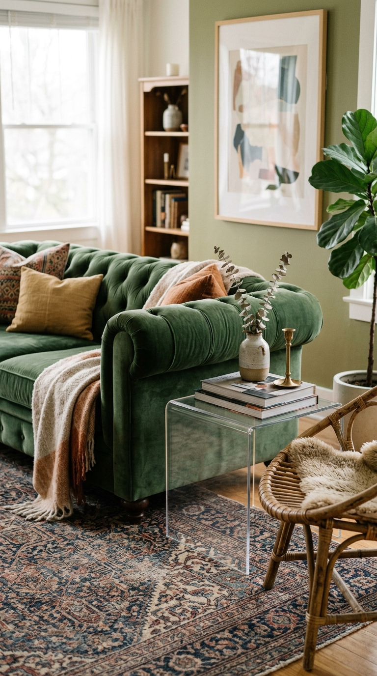
Mistake 5: The Showroom ‘Matchy-Matchy’ TrapWhen faced with an empty living room, it is incredibly tempting to walk into a large furniture retailer and purchase a complete, pre-coordinated set: the sofa, the matching loveseat, the matching reclining chair, and the matching coffee and end tables. While this approach is undeniably convenient and ensures that everything ‘goes together,’ it usually results in a room that feels flat, devoid of personality, and remarkably generic. It looks exactly like what it is: a showroom display, lacking the curated, collected-over-time character that makes a house feel like a unique home.The Solution: The most beautiful, magazine-worthy living rooms are intentionally curated with a mix of styles, eras, and textures. Break up those matching sets! If you have a matching sofa and loveseat, consider keeping the sofa and replacing the loveseat with a pair of contrasting accent chairs in a different fabric, pattern, or color. Mix your wood tones—a dark walnut coffee table pairs beautifully with lighter oak floating shelves. Combine a clean-lined, modern sofa with a vintage, ornate Persian rug. Mix metals in your lighting fixtures and hardware. By thoughtfully blending different textures (leather, velvet, linen, wood, metal), you create a deeply layered, visually fascinating room that tells a story and feels genuinely personal.
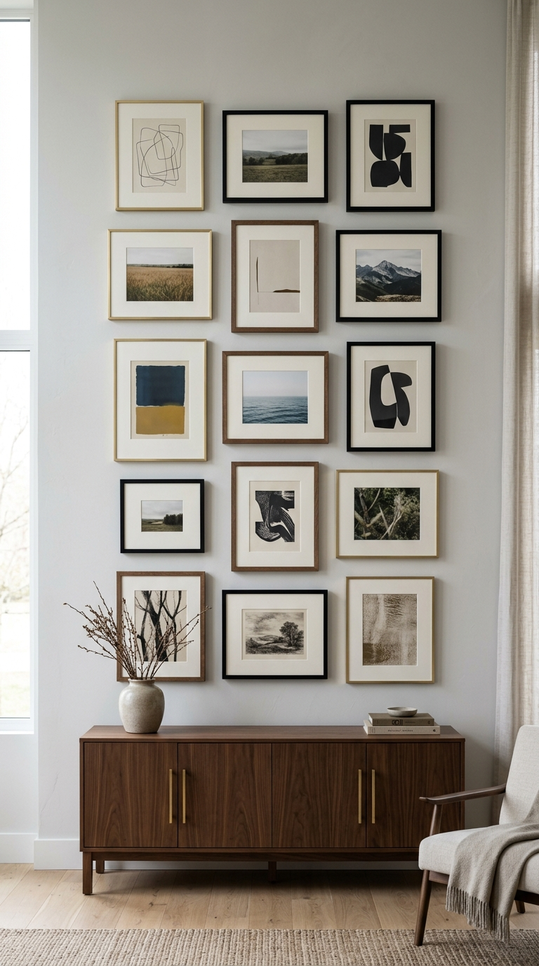
Mistake 6: Improper Artwork Scaling and PlacementArtwork is the finishing touch that brings a living room to life, but hanging it incorrectly can throw off the balance of the entire room. Two specific mistakes run rampant: hanging art far too high on the wall, and using art that is far too small for the wall it occupies. Art that is hung too high disconnects from the furniture below it, making it look as though it is floating away toward the ceiling. Similarly, a single, small 8×10 frame hung entirely alone on a massive, blank wall looks timid and completely out of proportion.The Solution: First, address the height. The general museum standard is to hang artwork so that the center of the piece (or the center of a gallery wall grouping) is roughly 57 to 60 inches from the floor—which is at average human eye level. If you are hanging art directly above a piece of furniture, such as a sofa or console table, the bottom edge of the frame should be just 4 to 8 inches above the top of the furniture to ensure they relate to one another visually. Regarding scale, bigger is usually better for statement walls. If you have a large wall, fill it. Use an oversized, dramatic canvas, or create a meticulously planned gallery wall using multiple frames to act as one large, cohesive unit. The art should confidently command the space it occupies.
Mistake 7: Ignoring the Importance of Traffic FlowA living room must look beautiful, but above all else, it must function beautifully. In the pursuit of aesthetics, it is incredibly common to cram too much furniture into a room, or to arrange it in a way that blocks natural pathways. If you constantly have to turn sideways to squeeze past a side table, or if you regularly bump your shins on an oversized coffee table while trying to sit on the sofa, your traffic flow is compromised. A poorly navigated room induces subtle, underlying stress and immediately detracts from the relaxing environment you are trying to cultivate.The Solution: Prioritize clearance and pathways in your layout. As a general rule of thumb, you need to maintain a minimum of 30 to 36 inches of clear walking space for major traffic routes through the room. Between your sofa and your coffee table, leave about 14 to 18 inches of space—close enough to comfortably reach a drink, but far enough away to allow your legs to extend comfortably. When planning your layout, literally walk through the room and note where the natural pathways lie (e.g., from the hallway to the sliding glass doors, or from the entryway to the kitchen). Ensure these main arteries remain completely unobstructed. By prioritizing functional movement, you guarantee that your beautifully designed living room is also a joy to live in every single day.
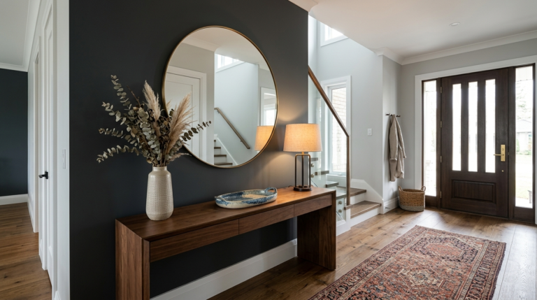
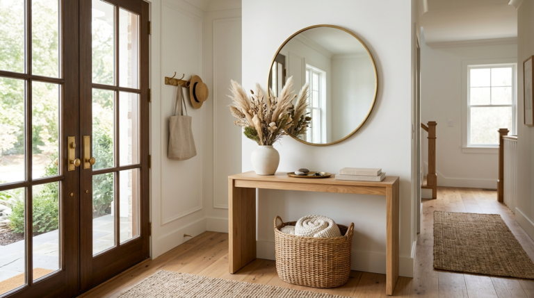
Transform your narrow hallways and cluttered entryways into a stunning first impression by avoiding these seven common decor mistakes. Read our full guide!
Transform your house into a haven. Discover the art of designing intentional living spaces that promote comfort, connection, and true well-being in every room.
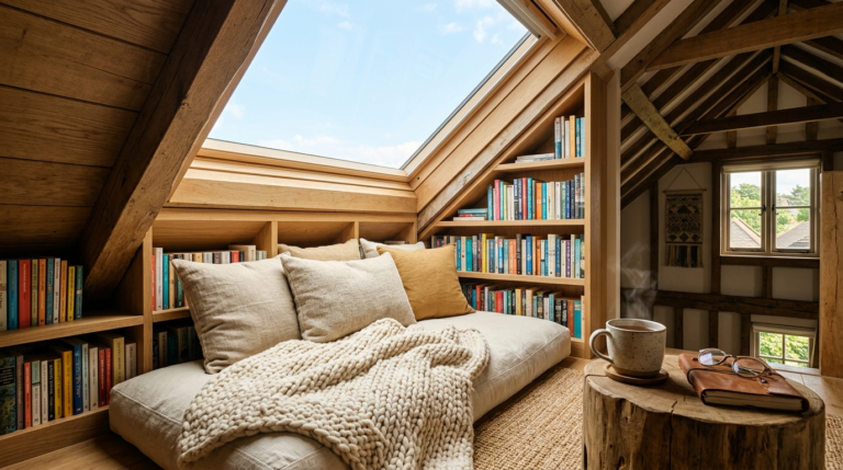
Turn your unused attic space into a stunning literary escape. Discover the best lighting, layout, and cozy decor tips to build your dream home reading nook.
Are you making these common entryway decor mistakes? Learn how to fix them easily and create a welcoming, organized, and stylish foyer that wows your guests.
Discover the ultimate living room layout ideas to optimize flow, maximize comfort, and create an inviting atmosphere. Transform your space with these tips.
Transform your entryway with our expert design guide! Discover the most common hallway decor mistakes to avoid and learn how to create a welcoming home.