When dealing with a compact culinary space, every single square inch matters profoundly. Many homeowners and renters alike struggle to find the perfect balance between functionality and aesthetic appeal in restricted areas. However, an undersized room does not mean you have to compromise on style or efficiency. The secret lies in understanding how visual weight, light, and smart organization play into the overall perception of space. In this comprehensive guide, we are diving deep into the most common small kitchen decor mistakes that people make, and providing actionable, transformative solutions to turn your cramped cooking area into a spacious-feeling, highly efficient haven.
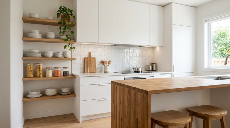
1. Ignoring Your Vertical Space Potential
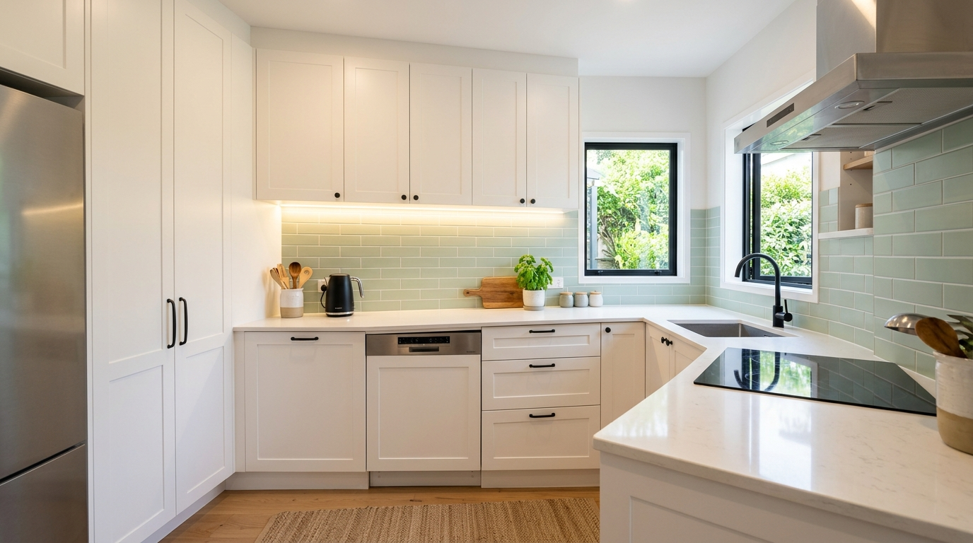
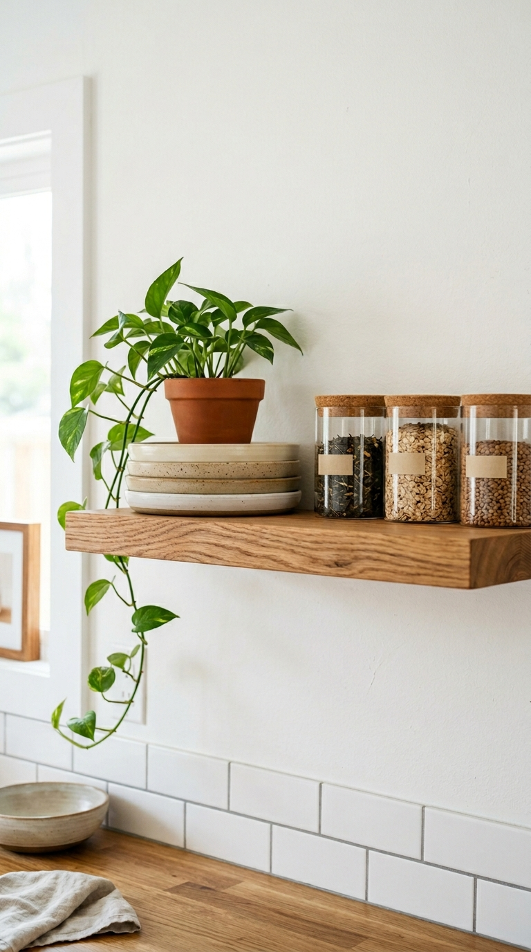
One of the most frequent missteps in compact room design is failing to look up. When floor space is practically non-existent, your walls become your most valuable real estate. Many people leave the area above their cabinets completely bare, or they fail to utilize the wall space between the countertop and the upper cabinets. This is a massive missed opportunity for both storage and stylistic expression. By extending your storage solutions all the way to the ceiling, you not only create more room for your culinary tools but also draw the eye upward, which creates the illusion of a taller, grander room.
To fix this, consider installing floating shelves, magnetic knife strips, or hanging rails for pots and pans. Open shelving can break up the heaviness of solid cabinet doors, making the walls feel less enclosed. If you are renovating, opt for custom cabinetry that reaches the ceiling to eliminate that awkward dust-catching gap while maximizing your shelving capacity. Baskets can be placed on top of existing cabinets to store rarely used items, keeping your immediate work zones clear and visually uncluttered.
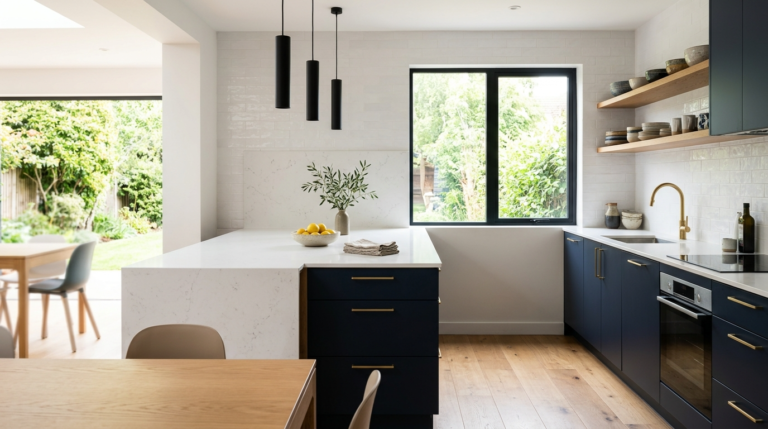
2. Relying Solely on Overhead Lighting
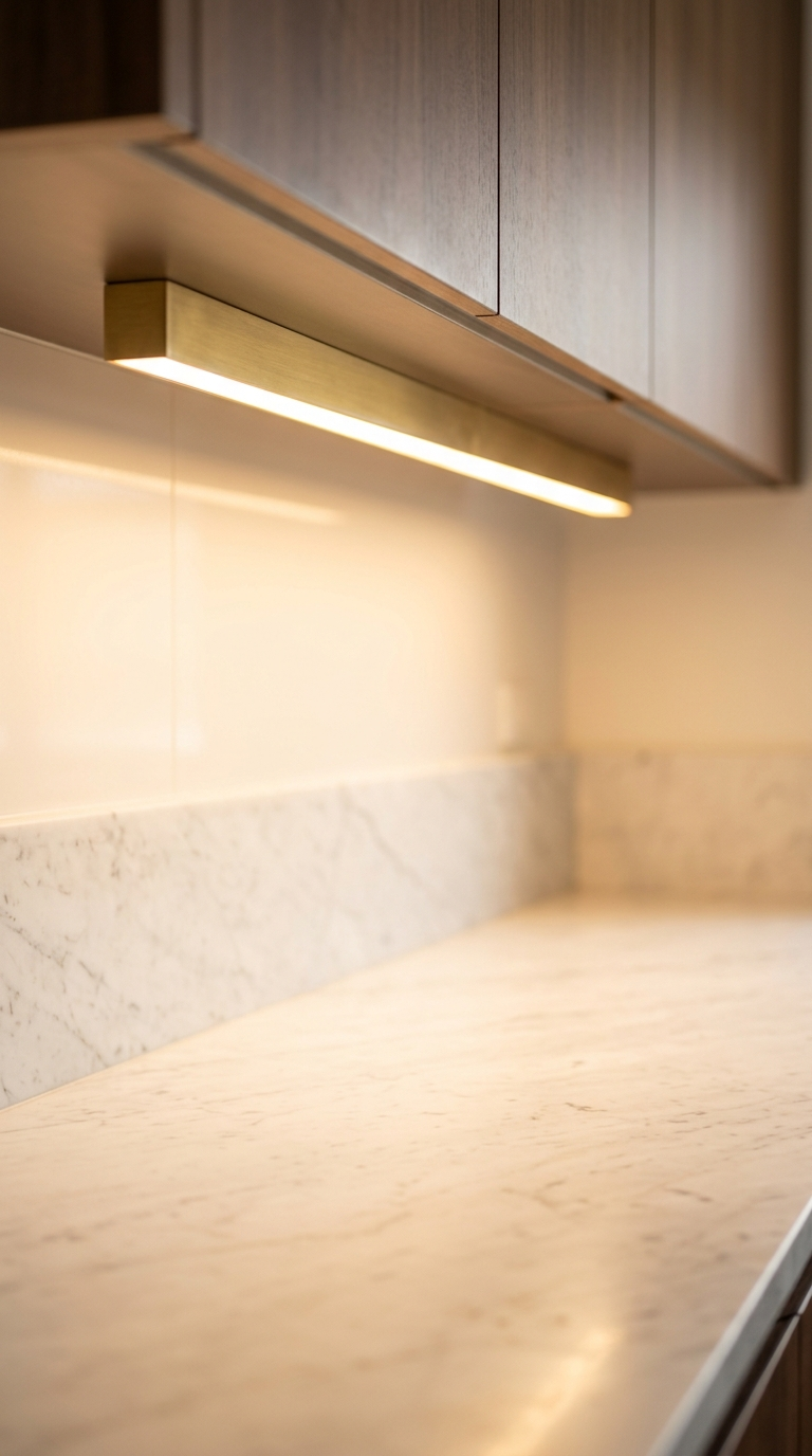
Lighting is the unsung hero of interior design, and its importance is magnified tenfold in a small room. A single, harsh overhead light fixture casts unflattering shadows, making corners feel dark and the room feel remarkably smaller than its actual dimensions. Shadows are the enemy of spaciousness. When light is not evenly distributed, the edges of the room recede into darkness, creating a cave-like atmosphere that is both uninviting and difficult to work in.
The solution is a layered lighting scheme. You absolutely need task lighting, ambient lighting, and accent lighting. Install LED strip lights or puck lights under your upper cabinets to illuminate your countertops perfectly. This not only makes meal preparation safer and easier but also visually pushes the walls back. Consider adding a stylish pendant light over the sink or a small island to act as a focal point. Wall sconces can also add a touch of elegance while freeing up precious ceiling and counter space. The brighter and more evenly lit the space, the larger it will feel.
3. Overcrowding the Countertops
Visual clutter is the fastest way to make an already limited space feel claustrophobic. Leaving every appliance, utensil crock, and decorative item on the countertop eats away at your usable workspace and creates a chaotic visual environment. In a small space, the eye needs places to rest. When every surface is covered, the brain perceives the room as messy and overwhelming, regardless of how clean it actually is.
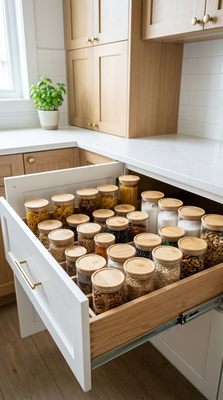
Adopt a strict minimalist approach for your surfaces. The only items that should live permanently on your counters are the ones you use absolutely every single day, such as a coffee maker or a toaster. Everything else needs a designated home inside a cabinet or drawer. Utilize clever internal organizers, like pull-out pantry shelves, drawer dividers, and cabinet door racks, to house your items efficiently. Appliance garages are fantastic for hiding away mixers and blenders while keeping them accessible. The more continuous, clear countertop you can see, the more expansive the room will appear.
4. Choosing Overly Dark or Heavy Color Palettes
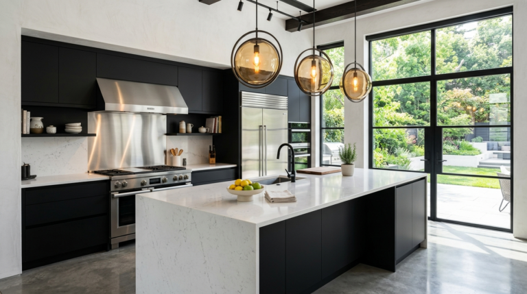
While moody, dark interiors are incredibly trendy, they require an abundance of natural light and square footage to pull off without feeling oppressive. Dark paints and dark, heavy wood cabinets absorb light. In a small space, this absorption can make the walls feel as though they are closing in on you. It creates a heavy, anchored feeling that works against the goal of creating an airy, open environment.
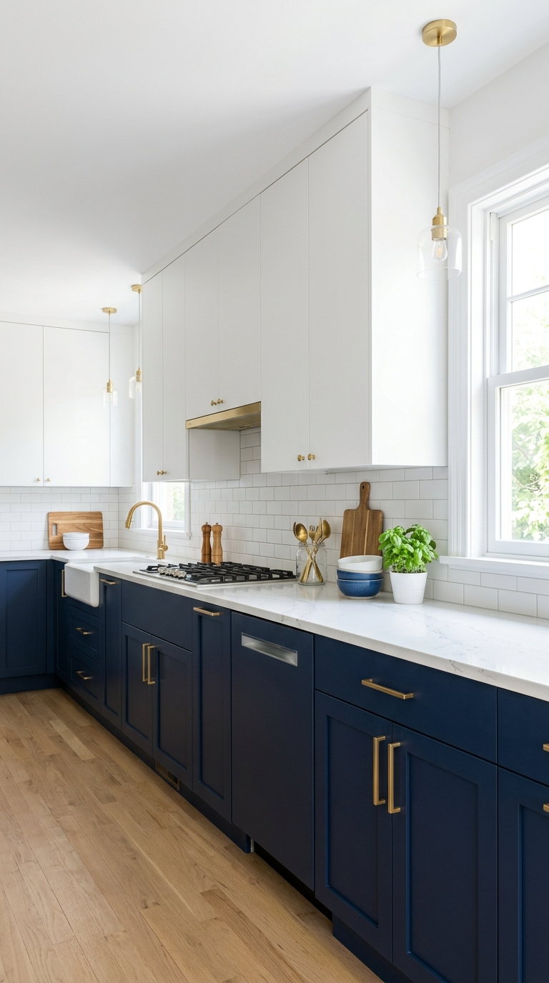
Embrace light, reflective colors to maximize the feeling of space. Crisp whites, soft creams, pale grays, and pastel tones bounce light around the room, making it feel fresh and open. If you love color, consider a two-toned cabinet approach: paint the lower cabinets a deep, grounding shade like navy or forest green, and keep the upper cabinets bright white to blend seamlessly with the walls. This tricks the eye into thinking the ceilings are higher. Glossy finishes on tiles and cabinets can also help reflect light, further enhancing the spacious illusion.
5. Buying Oversized or Bulky Appliances
It is easy to fall in love with a massive, professional-grade range or a giant, double-door refrigerator, but forcing oversized appliances into a compact layout disrupts the flow and eats up vital storage space. Bulky appliances jut out past the standard counter depth, creating visual roadblocks and making the room feel disjointed. Scale is everything in small space design.
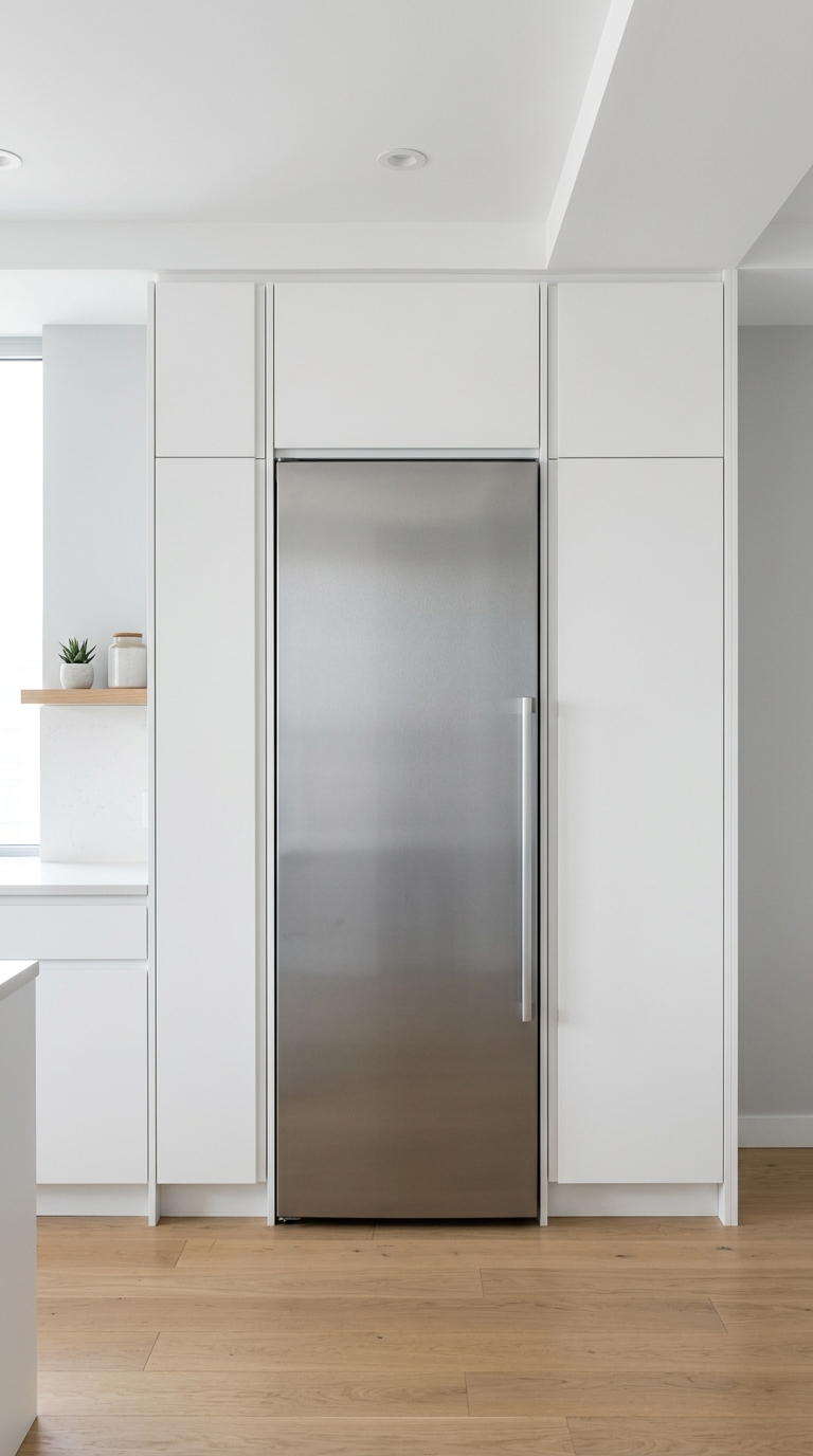
Today, many manufacturers offer high-end, European-style compact appliances that pack all the features of their larger counterparts into a slim, space-saving footprint. Look for 18-inch dishwashers, 24-inch ranges, and counter-depth refrigerators. These streamlined options sit flush with your cabinetry, providing a seamless, custom look that significantly enhances the perceived size of the room. A sleek, integrated appliance package creates smooth visual lines, which is crucial for maintaining an uncluttered aesthetic.
6. Neglecting Texture and Pattern
In the pursuit of a clean, uncluttered look, many people go too far and end up with a sterile, hospital-like environment. A room consisting entirely of flat, smooth surfaces in a single color can feel cold and unwelcoming. While we want to avoid visual clutter, we desperately need visual interest. Without texture and subtle patterns, a small space lacks depth and personality.
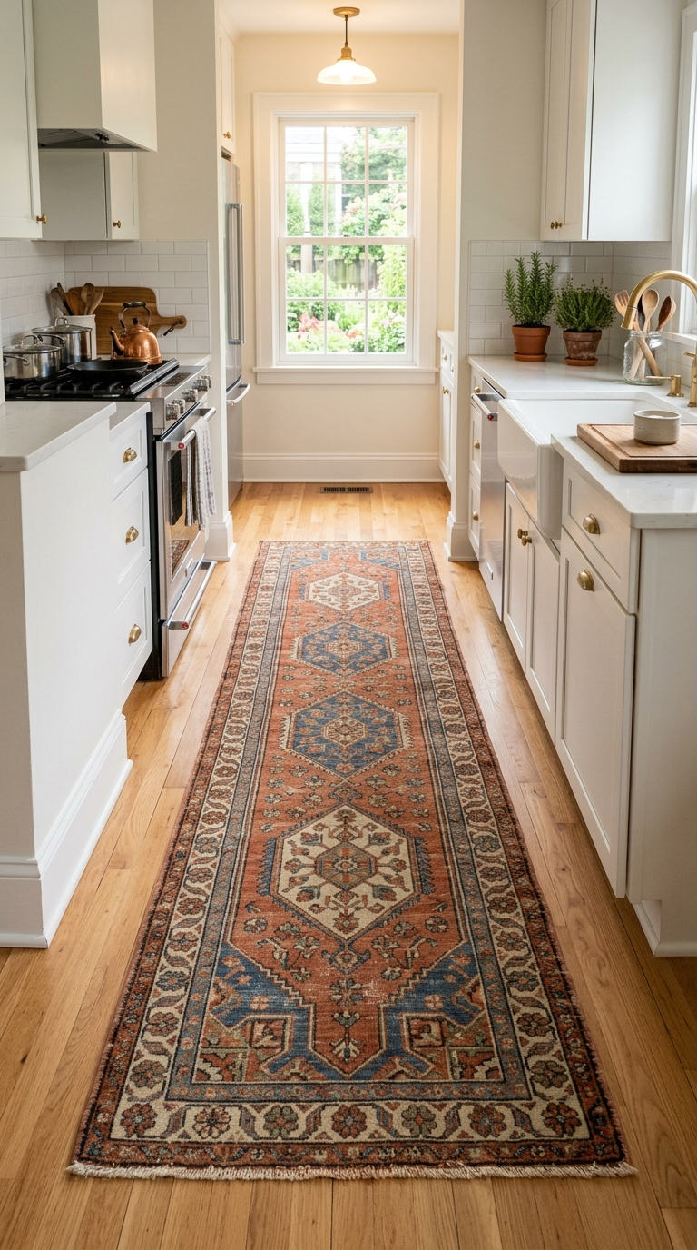
Introduce warmth and character through materials. A heavily textured tile backsplash, a vintage runner rug on the floor, or natural wood accents can instantly elevate the design without adding physical bulk. Consider the hardware as well; swapping out standard builder-grade knobs for brushed brass or matte black pulls can serve as the jewelry of the room. A patterned floor tile can anchor the space beautifully, drawing the eye down and adding a layer of sophistication. The key is to balance these elements so they complement rather than compete with one another, resulting in a cohesive, perfectly scaled sanctuary.
Are you planning a modern kitchen remodel? Avoid these costly and frustrating design mistakes to ensure your new culinary space is both beautiful and functional.
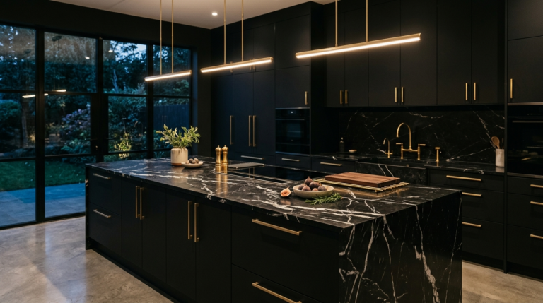
Discover the ultimate trend forecast for black and dark kitchens, featuring expert design tips on matte cabinetry, mood lighting, and stone selections.
Discover the most common kitchen design mistakes and learn how to avoid them. Transform your cooking and dining area into a flawless, functional space.
Are you struggling with a dysfunctional cooking space? Learn the most common kitchen layout mistakes and practical solutions to maximize your dining area.
Discover the most frequent kitchen design mistakes and how to avoid them. Learn expert tips on layout, lighting, and storage to create your dream dining space.