Your entryway is the prologue to your home’s story. It sets the immediate tone for the rest of the house, offering guests their first impression and providing you with a daily transition space between the outside world and your private sanctuary. Yet, despite its importance, the hallway is often the most neglected area in interior design. It frequently becomes a dumping ground for shoes, mail, and coats, or conversely, a sterile, empty corridor lacking any personality. In this comprehensive guide, we are exploring the nine most common entryway and hallway decor mistakes and providing sleek, minimalist, and highly effective solutions to transform your space into a clean, welcoming, and organized masterpiece.
Adopting a minimalist and clean aesthetic for your entryway doesn’t mean the space has to feel cold or clinical. Rather, it is about intentionality. Every item in a minimalist entryway must serve a purpose—either functional or aesthetic—while maintaining a sense of breathing room and visual calm. By identifying these common pitfalls and applying our strategic fixes, you will learn how to maximize natural light, implement smart storage, and create a seamless flow that elevates the architecture of your home.
Mistake 1: Ignoring the Power of Appropriate Scale
One of the most frequent errors in entryway design is using furniture and decor that are entirely out of scale with the space. A massive, heavy credenza in a narrow hallway will make the area feel claustrophobic and impede traffic flow. Conversely, a tiny, delicate console table in a grand, double-height foyer will look lost and insignificant. Scale is the foundational rule of minimalist design.
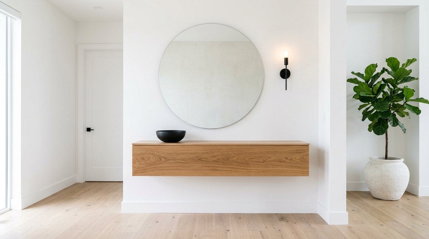
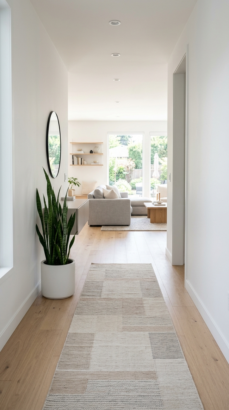
The Fix: Measure your space meticulously before purchasing anything. For narrow hallways, look for slim-profile console tables with a depth of no more than 10 to 12 inches. Wall-mounted floating shelves or cabinets are phenomenal alternatives that keep the floor clear, enhancing the illusion of space. In larger foyers, ground the area with a substantial piece, such as a large round center table or a long, minimalist bench. The negative space around your furniture is just as important as the furniture itself; leave ample room for comfortable movement.
Mistake 2: The “Drop Zone” Clutter Catastrophe
The entryway is a high-traffic transition zone, which naturally attracts clutter. Keys, loose change, unopened mail, dog leashes, and sunglasses often accumulate on any available flat surface, instantly destroying the clean, minimalist aesthetic and creating visual anxiety the moment you walk through the door.
The Fix: Implement a strict, closed-storage system. Minimalism relies on clean surfaces. Instead of open trays, use an elegant, opaque ceramic bowl or a sleek wooden box with a lid for keys and small items. If your console has drawers, utilize internal dividers to keep everything out of sight. For mail, create a rule to sort it immediately upon entry, recycling junk mail before it ever hits a table. Incorporate a beautiful, minimalist woven basket on the floor for items like umbrellas or reusable shopping bags, ensuring everything has a designated, hidden home.
Mistake 3: Inadequate and Harsh Lighting
Hallways are notoriously devoid of natural light, often relegated to the dark core of a house. Relying solely on a single, harsh overhead flush-mount fixture creates a gloomy, institutional atmosphere that casts unflattering shadows. Lighting is a crucial element in establishing a warm, welcoming, yet clean environment.
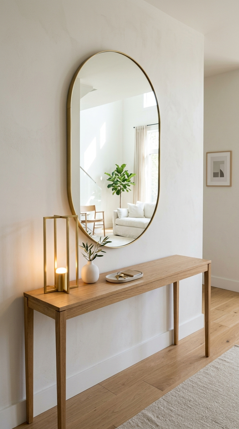
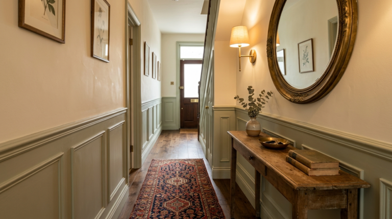
The Fix: Layer your lighting. Start with an eye-catching but cleanly designed overhead fixture—a sleek structural pendant or a minimalist flush mount in matte black or brushed brass. Then, introduce secondary ambient lighting. A structural, modern table lamp on your console adds a warm, inviting glow at eye level. If you lack table space, consider hardwiring slim, minimalist wall sconces flanking a mirror. Ensure your bulbs are a warm white (around 2700K-3000K) to soften the space while maintaining crisp visibility.
Mistake 4: The Wrong Sized Rug (or No Rug at All)
Skipping a rug leaves an entryway feeling unfinished and acoustic echoes bouncing off hard floors. However, placing a small, postage-stamp-sized mat in front of the door is equally problematic; it looks disproportionate and fails to catch dirt effectively, breaking up the visual flow of the floor.
The Fix: Choose a rug that properly defines the space. For long hallways, invest in a beautiful, high-quality runner that stretches at least three-quarters of the hallway’s length, leaving an even border of exposed flooring on all sides. For a wider foyer, a large vintage-inspired or subtle geometric rug grounds the room. Ensure the door can open and close easily over the pile. Opt for materials that are both durable and easy to clean, such as flat-weave wool or high-end synthetic blends in muted, neutral tones that complement the minimalist vibe without demanding too much attention.
Mistake 5: Neglecting Vertical Space and Mirrors
Many homeowners focus entirely on what is sitting on the floor or the table, completely ignoring the vast expanse of wall space in an entryway. This leaves the area feeling bottom-heavy. Furthermore, failing to include a mirror is a missed opportunity for both functionality and spatial enhancement.
The Fix: Draw the eye upward. A large, minimalist mirror is an absolute necessity in an entryway. It serves the practical purpose of a final outfit check before leaving, but more importantly, it bounces light around the room and visually doubles the size of a cramped hallway. Opt for a simple, thin metal frame or a frameless pill-shaped or oversized round mirror. Flank it with vertical art or tall, structural floral arrangements (like simple branches in a clear vase) to emphasize the height of the ceiling and balance the composition.
Mistake 6: The Coat and Shoe Mountain
An overflowing coat rack or a disorganized pile of shoes by the front door is the antithesis of a clean, minimalist home. It is visually chaotic and creates a literal tripping hazard, making the home feel instantly messy regardless of how clean the rest of the house might be.
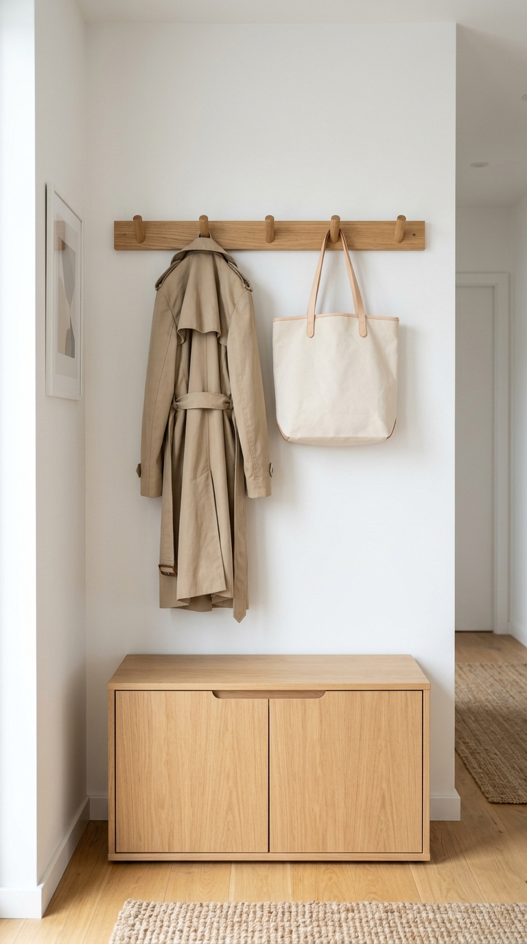
The Fix: Edit ruthlessly. The entryway should only house the coats and shoes you are currently wearing this season. Store off-season items in bedroom closets. Replace bulky standing coat racks with sleek, wall-mounted peg rails or individual architectural hooks spread evenly across the wall. For shoes, utilize a closed shoe cabinet with tip-out drawers. These pieces are incredibly slim (often only 6 to 9 inches deep) but can hold dozens of pairs completely out of sight, maintaining the flawless, uncluttered lines of your hallway.
Mistake 7: Lack of Seating
Expecting guests (or yourself) to hop on one foot while attempting to put on or take off shoes is uncomfortable and impractical. A functional entryway requires a place to sit, but many people omit this due to perceived space constraints.
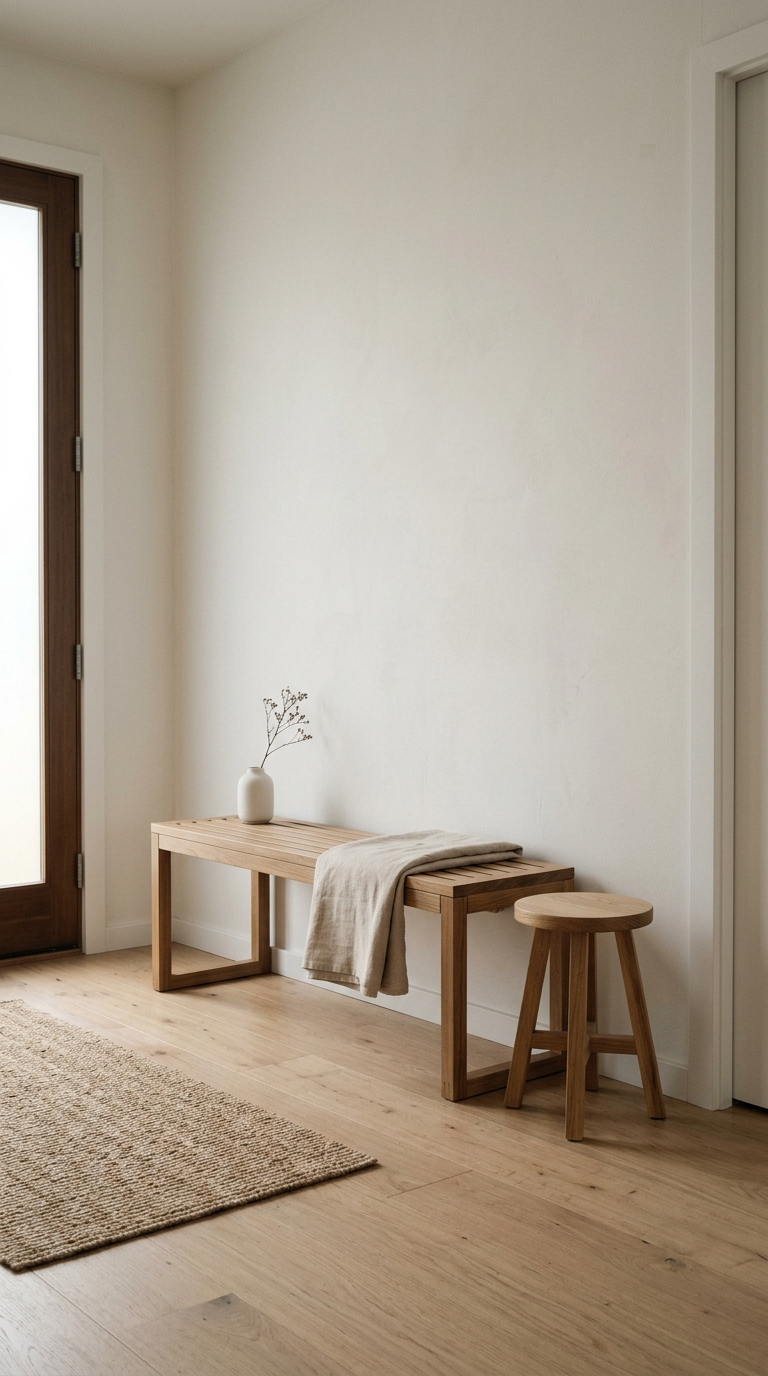
The Fix: Integrate seating that aligns with minimalist principles. You do not need a massive armchair. A sleek, narrow wooden bench with clean, Scandinavian lines works perfectly along a hallway wall. If space is incredibly tight, a single, sculptural stool tucked under a floating console or in a corner provides necessary function without adding visual bulk. Choose seating with open legs rather than a solid base to allow light to pass through, maintaining a sense of airiness.
Mistake 8: Forgetting a Touch of Life
In the pursuit of minimalism, spaces can sometimes become too sterile, lacking warmth and organic energy. An entryway composed entirely of hard surfaces, right angles, and neutral colors can feel like a commercial lobby rather than a welcoming home.
The Fix: Introduce organic elements with restraint. A single, perfectly placed plant can breathe life into a clinical space. Choose architectural plants that fit the clean aesthetic, such as a tall Snake Plant in a matte cylinder pot, or a minimalist arrangement of dried eucalyptus branches in a textured ceramic vase. The organic curves and natural textures of the greenery provide a necessary visual break from the rigid lines of the furniture, adding a layer of subtle, refined warmth.
Mistake 9: Inconsistent Style with the Rest of the Home
Sometimes, in an effort to make a dramatic statement, the entryway is decorated in a style completely disconnected from the rest of the house. Walking from a dark, heavily patterned, moody foyer straight into a bright, airy, minimalist living room creates a jarring, disjointed experience.
The Fix: Ensure stylistic continuity. Your entryway should offer a curated preview of what is to come. If your home features a minimalist, clean aesthetic with neutral tones and light oak woods, those same materials and color palettes must be present in the hallway. Use the entryway to introduce your home’s primary accent color in a subtle way—perhaps through the runner rug or a single piece of abstract art. This cohesion creates a sense of harmony and intentional design from the very first step inside.
Conclusion: The Art of the Entrance
Fixing these common entryway mistakes requires a shift in perspective. It is about prioritizing function while rigorously maintaining form. By clearing the clutter, optimizing your lighting, scaling your furniture correctly, and introducing thoughtful, closed storage solutions, you can completely transform your hallway. A minimalist entryway is not about having nothing; it is about having exactly what you need, arranged beautifully. Implement these clean, sophisticated fixes, and you will create an entrance that welcomes you home with a sense of calm, order, and undeniable style every single day.
Learn exactly how to transform a cramped, narrow hallway into a beautifully warm, welcoming, and functional entryway with this step-by-step classic design guide.
Step into elegance with our ultimate guide to designing a luxury entryway. Discover sophisticated styling tips to create a truly unforgettable first impression.
Explore the most captivating living room trends of the year. Uncover imaginative decor ideas, playful colors, and whimsical layouts for a magical space.
Turn your unused attic space into a stunning literary escape. Discover the best lighting, layout, and cozy decor tips to build your dream home reading nook.