The bathroom is often the first room we visit in the morning and the last one we see before going to bed. It should be a sanctuary of cleanliness, relaxation, and unparalleled functionality. However, because it is heavily constrained by plumbing, limited square footage, and demanding environmental factors like high humidity, it is also one of the easiest rooms in the house to get terribly wrong. Achieving a truly breathtaking minimalist and clean bathroom requires intense discipline. When executed poorly, a bathroom can feel cramped, chaotic, and decidedly un-relaxing. Many homeowners, in their eagerness to renovate, fall victim to common design pitfalls that compromise both the aesthetics and the utility of the space. In this extensive guide, we will dissect seven critical bathroom decor and layout mistakes. By understanding these errors and implementing our expert, clean-lined solutions, you can guarantee that your next bathroom project results in a serene, spa-like environment that elevates your daily routines.
Mistake 1: Treating Lighting as an Afterthought
Perhaps the most pervasive and damaging mistake in bathroom design is poor lighting. Relying solely on a single flush-mount ceiling fixture or a poorly positioned light above the mirror creates harsh, unflattering downward shadows. This makes daily tasks like shaving or applying makeup frustrating and visually ages anyone looking in the mirror. Furthermore, harsh lighting completely shatters the calming, minimalist aesthetic, making the room feel clinical rather than spa-like.
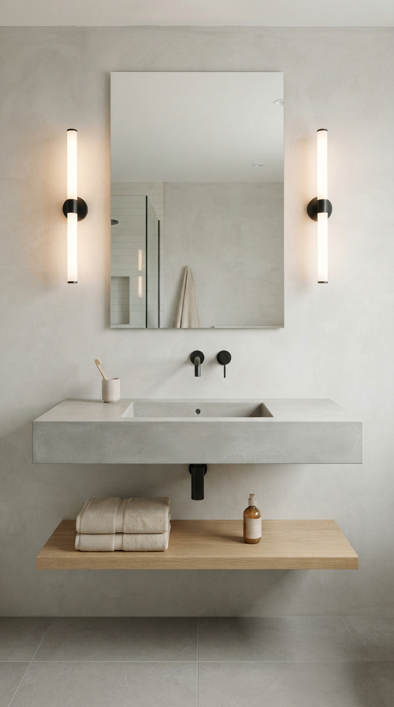
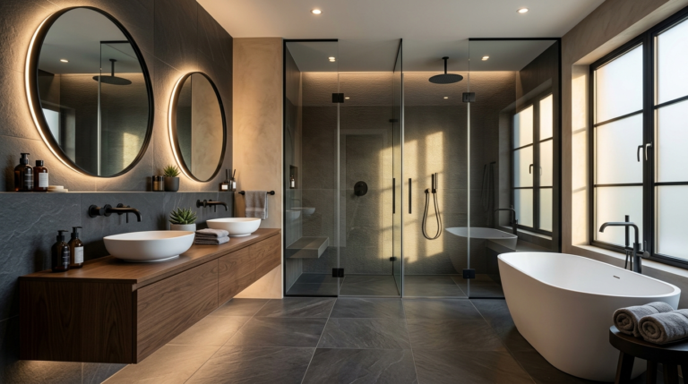
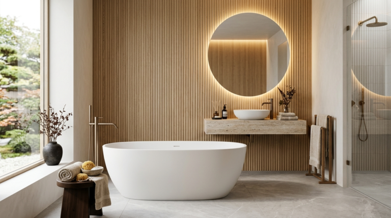
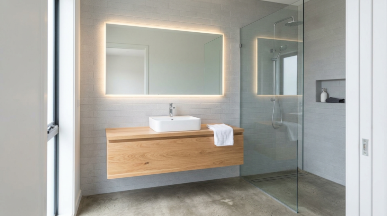
The Solution: A clean, modern bathroom demands layered lighting. Begin with soft ambient light through recessed LED fixtures on dimmers. Next, address task lighting by installing sleek, vertical sconces on either side of the vanity mirror at eye level; this cross-illumination eliminates facial shadows entirely. Finally, introduce accent lighting, such as a hidden LED strip under a floating vanity, to create a subtle, floating effect that enhances the minimalist vibe during nighttime visits. Always choose bulbs with a high Color Rendering Index (CRI) and a neutral color temperature (around 3000K-3500K) to ensure skin tones look natural and healthy.
Mistake 2: Severely Underestimating Storage Needs
Minimalism is not about having no possessions; it is about having a dedicated, concealed space for everything. A major mistake homeowners make is opting for a beautiful, sculptural pedestal sink or an open-shelved vanity without considering where the toothpaste, spare towels, and cleaning supplies will actually live. When everyday items are left out on the countertops, visual clutter instantly destroys the clean aesthetic you worked so hard to achieve.
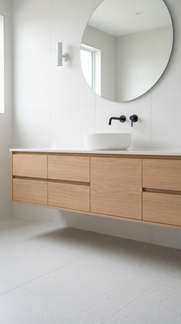
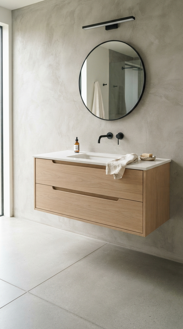
The Solution: Prioritize closed storage solutions that maintain sleek exterior lines. A floating vanity with deep, soft-close drawers provides massive storage volume while keeping the floor visible, which tricks the eye into perceiving a larger room. Recess a mirrored medicine cabinet flush into the wall to hide daily grooming tools without projecting into the space. If square footage permits, build a floor-to-ceiling linen tower that matches your vanity cabinetry exactly, presenting a monolithic, seamless facade that swallows clutter whole.
Mistake 3: Poor Tile Proportion and Grout Lines
Choosing the wrong tile can visually fracture a room. Using tiny mosaic tiles all over the floor and walls introduces hundreds of intersecting grout lines. In a small space, this creates a busy, grid-like appearance that completely overwhelms the eye. Furthermore, white grout on a bathroom floor will inevitably discolor over time, turning your pristine minimalist retreat into a maintenance nightmare that never looks truly clean.
The Solution: To achieve a flawless, expansive look, utilize large-format tiles (such as 24×24 inches or even larger slabs) for both the floors and walls. Fewer grout lines translate to a visually continuous surface that feels incredibly high-end and modern. When selecting grout, match the color precisely to the tile to further camouflage the joints. Materials like large matte porcelain or expansive sheets of engineered quartz offer incredible durability and a completely seamless, minimalist aesthetic that is incredibly easy to keep immaculate.
Mistake 4: Overlooking Proper Ventilation
While not strictly a ‘decor’ item, failing to install an adequate exhaust fan is a fatal design flaw. Humidity is the enemy of a clean bathroom. Without proper ventilation, steam from the shower settles on walls and ceilings, eventually leading to peeling paint, warped cabinetry, and the rapid growth of mold and mildew. Nothing ruins a minimalist, pristine aesthetic faster than a ceiling covered in dark moisture spots.
The Solution: Invest in a high-quality, ultra-quiet exhaust fan correctly sized for the cubic footage of your room. Look for modern designs that sit completely flush with the ceiling, with minimalist grilles that disappear into the architecture. Wire the fan to a moisture-sensing switch or a timer so that it runs for at least 30 minutes after every shower, ensuring all latent humidity is entirely evacuated from the space.
Mistake 5: Disrupting Sightlines with Visual Barriers
In smaller bathrooms, chopping up the space with opaque shower curtains, framed shower doors with heavy metal tracks, or half-walls creates a cramped, boxy feeling. It stops the eye from traveling across the room, making the footprint feel significantly smaller than it actually is, completely contrary to the expansive goals of modern minimalist design.
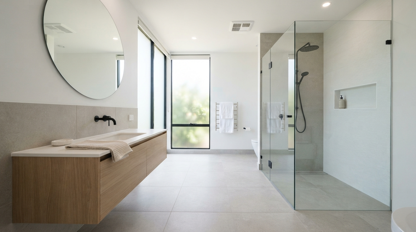
The Solution: Emphasize continuous sightlines. Opt for completely frameless, low-iron clear glass shower enclosures. This allows the eye to travel all the way to the back wall of the shower, visually expanding the room’s dimensions. Carry the same floor tile directly into the shower basin (using a linear drain for a sleek look) rather than introducing a bulky, contrasting shower tray. This continuous floor plane creates a breathtakingly seamless, open-concept environment.
Mistake 6: Introducing Too Many Competing Materials
A common error for overzealous designers is trying to incorporate every trend into a single room. A patterned floor tile, a bright subway tile in the shower, a wild granite countertop, and mixed metal hardware will result in a chaotic, noisy design. True clean, minimalist design relies on restraint.
The Solution: Stick to a rigorously tight materials palette. Select a maximum of three core finishes: one dominant material (like a large format warm grey tile for floors and walls), one accent material (such as a smooth, flat-panel white oak vanity for natural warmth), and one consistent hardware finish (like brushed nickel or matte black). By repeating these elements throughout the room, you achieve a harmonious, unified aesthetic that instantly calms the mind upon entering.
Mistake 7: Ignoring the Details and Accessories
The final mistake occurs at the finish line. You have installed the perfect tile and a gorgeous floating vanity, but then you bring in mismatched, brightly colored plastic shampoo bottles, a heavily patterned fuzzy bath mat, and an oversized trash can. These small, discordant details instantly cheapen the expensive minimalist architecture you just built.
The Solution: Curation is everything in a clean design. Decant your soaps and shampoos into matching, sleek pump bottles. Use high-quality, solid-colored plush towels in white or soft grey. Choose a simple, geometric bath mat that blends with the floor tile, and invest in a minimalist waste basket that tucks discreetly away. By strictly controlling the visual noise of your everyday objects, you maintain the serene, architectural purity of your beautiful new bathroom.
Planning a bathroom renovation? Discover the most common remodeling mistakes that cost you time and money, and learn how to create your perfect oasis today.
Avoid costly design errors with our guide to common bathroom decor mistakes. Learn how to transform your bathroom into a functional, beautiful spa oasis.
Struggling with a messy, disorganized laundry room? Discover 16 brilliant storage ideas and organization hacks to maximize space and streamline your chores.
Unlock the secrets to maximizing space and elevating style in a compact bathroom. This step-by-step guide helps you create a premium, luxurious oasis at home.
Are your bathroom and laundry spaces inefficient or dated? Discover the most common design mistakes homeowners make and learn how to fix them for a sleek, clean look.